


Basics for User-Friendly Design

Design is an essential, yet often overlooked part of creating digital experiences. Designing with your users in mind from start to finish can go a long way in improving how users interact with your product.
Intro
When creating apps and other digital experiences it's easy to get distracted by what we want our users to do, and not what they want or need to do. This can result in frustration and a bad user experience or worse - users finding an offline analog solution to a problem we spent time automating. When we instead focus on the user’s goals and experiences, this is called Human-Centered Design and is an essential part of a successful digital experience. Here are a few simple ways we can keep our users in mind when creating apps.
Don't Break User Expectations
Our users spend more time interfacing with digital experiences now than ever before. Everything from banking and shopping, to learning and socializing has moved online. As such, users have expectations as to how to interact with a digital product. The best experiences don't need instructions - they're intuitive and effortless. Think about the last time you walked through a door. Did you have to think about it? Most of us don't think about the user experience of a door until it's a bad one. A pull handle on a push door will throw us out of our groove and we remember that negative experience. If we experience it every day, it will be a daily frustration and become the talk of the office.
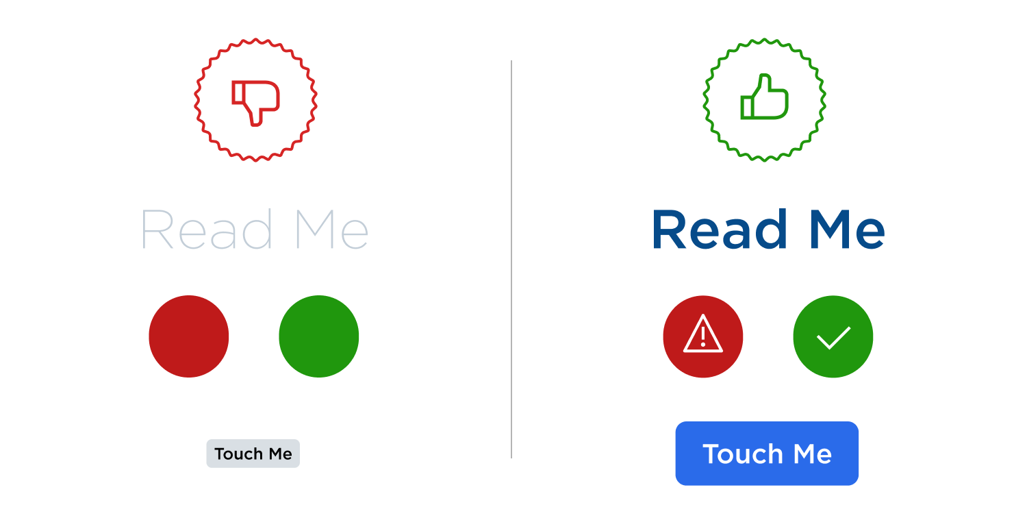
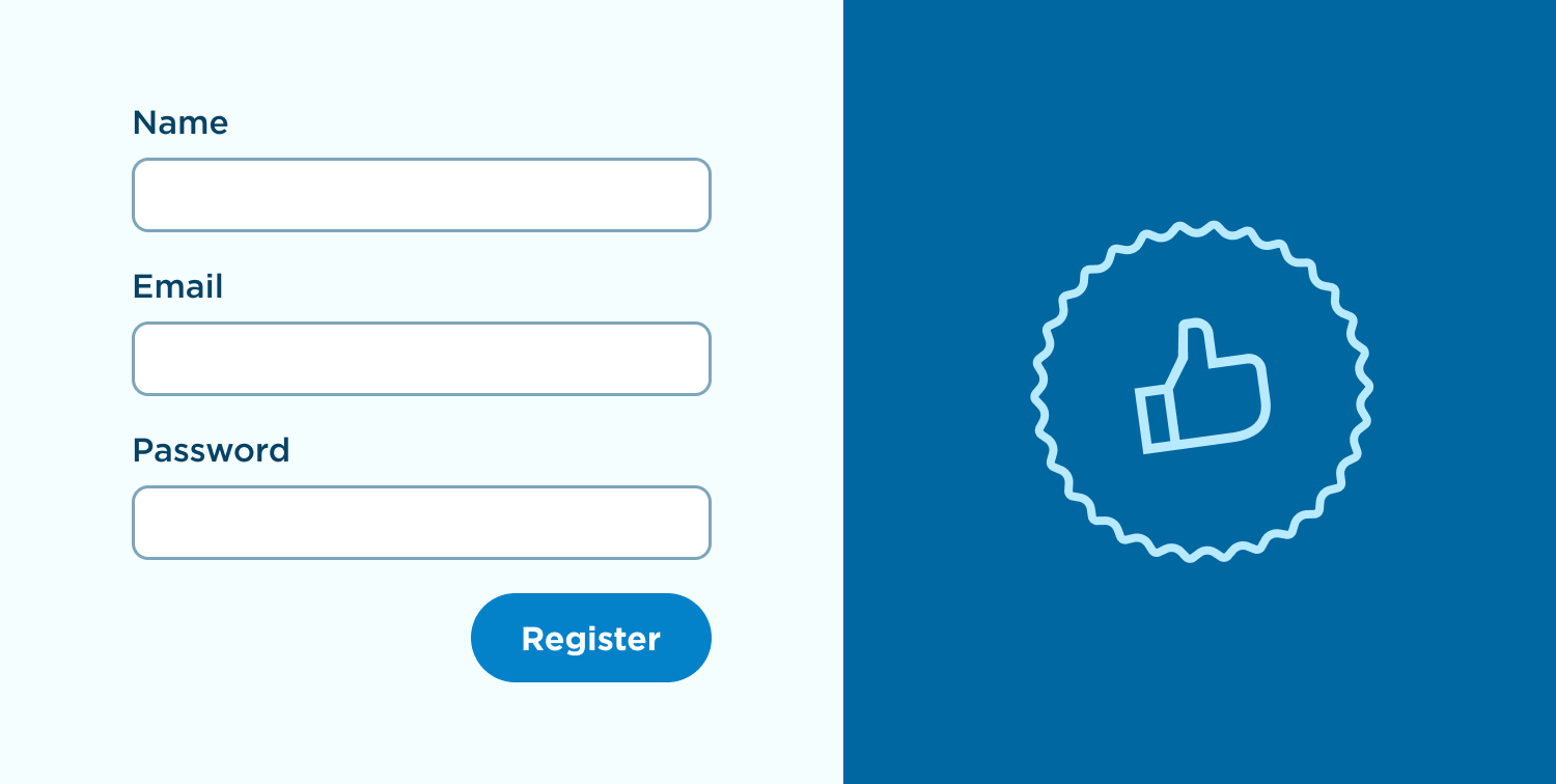
The same goes for digital interactions. If a user is trying to complete a form, they expect to read it from left to right and top to bottom. They expect "next" or "submit" to be at the bottom, below the form. They expect next on the right and previous on the left. They expect the submit to be a large, obvious button and cancel (if applicable) to be less obvious and to that button's left. If there are other ways a user can interact with the app that is optional or secondary to their primary goals, they will be confused if those interactions are more prominent than their actual goal. We can use things like size, color, and hierarchy to express importance and priority to our users. Breaking these expectations is like putting a pull handle on a push door. Users will make mistakes, and they will get frustrated.

Cut Your Users Some Slack
Users make mistakes. A good digital experience gives users room to make mistakes and doesn't punish them for doing so. In the example of the form from the last section, a user might have made a small mistake on one of several pages in a complex submission. We can account for this by giving a "summary" or "confirmation" screen where users are given an overview and can correct any mistakes they may have made. Editing that mistake should not reset all of their progress. By making mistakes permanent, we waste valuable time or cause our users frustration. Some users will put less effort into their second attempt or quit entirely.
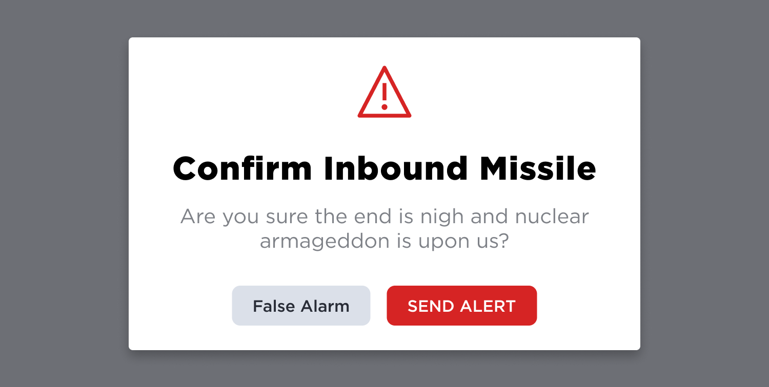
Additionally, any destructive or irreversible action should always ask for confirmation. We certainly don't want to waste our user's time, but when a user has spent lots of time working on something, accidentally clicking the delete button instead of the submit button can mean valuable minutes, or even hours being lost in an instant. Whenever deleting, canceling, or removing anything ask users "are you sure you want to do that?"
Failing to do so can cause frustration at best or total panic at worst. When Hawaiians woke up to a notification on their phone that nuclear missiles were headed to the islands and to take cover, people hid their children in sewers, called their parents to tell them they love them, and kissed their loved ones goodbye. In reality, the operator of the alert system had accidentally clicked the wrong button when attempting to test their system. The media blamed the operator, but anyone could have made that mistake. The system was designed to fail. It could have been avoided by making the test button and the panic button obviously different or simply by asking the operator: "are you sure nuclear missiles are incoming?"
Design Using “Gestalt” Principles
The Psychological principles known as “Gestalt” are principles designers use to help our brains make sense of visual information. Our brains are good at detecting patterns. This means they want to detect patterns to make the world around us make more sense. Some of the most important gestalt principles to user design are proximity, similarity, and figure-ground relationship.
Proximity
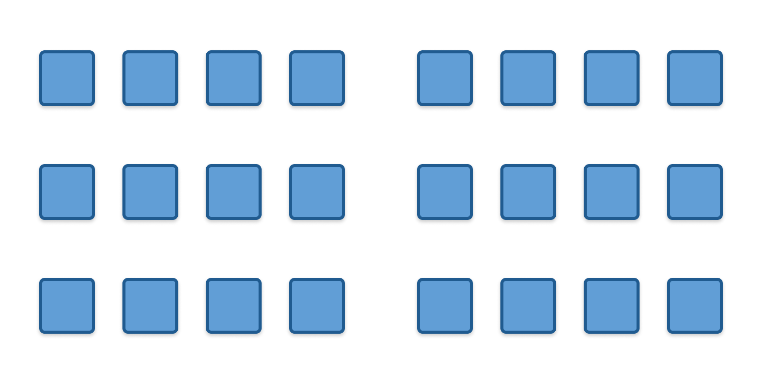
The principle of proximity dictates that our brains will associate things that are closer to each other than they are to the things around them. In the figure below, we group the shapes closest as being related, even though they aren’t different from the shapes around them. We can take advantage of this by placing headers close to body copy, and then giving additional space between unrelated content. This article does that, and your brain subconsciously determined that the header to this paragraph and its content were related.
Similarity
The principle of similarity dictates that we will group similar objects based on their shared traits, even if they are spaced equally, or mixed in with a group. The opposite is also true, it means something markedly different than its surroundings will stand out. We can use this to our advantage by making similar content look similar, but different from unrelated content, or by making our most important calls to action stand out from the crowd.
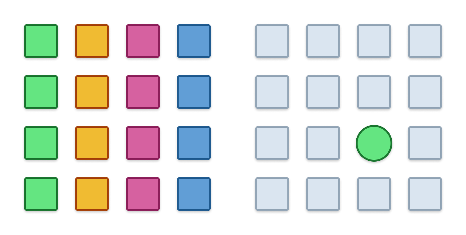
Figure-Ground
A figure-ground relationship is when our brain selects something as the background and pays less attention to it than the object of focus. In photography, we’re drawn to the face of a person, even if there’s beautiful scenery surrounding it. Often photographers will make the background blurry just so users focus on what they want us to. We can take advantage of this in our designs by picking simple, neutral backgrounds and using high contrast between the things we want our users to see and interact with, and the space which it occupies.
There are plenty more of these principles, and we've only dipped our toes in the water regarding how gestalt affects behavior. If you’d like to learn more you can check out this blog by Toptal.
Consider Accessibility Limitations
When we design for our users, we need to keep in mind the limitations they may have. Some users have limited or impaired vision. To accommodate their needs, we need to be sure that our colors have appropriate contrast. Black on white is always a safe bet, but we can incorporate our brand identity by using brand colors as well. A dark blue on white or the reverse for example maintains contrast while allowing for some personality. Making sure text is large enough (usually at least 16 pixels for long content) is also necessary. A text hierarchy, where headers are larger than the body will also assist scannability. Other visual impairments like color blindness can also affect a user's experience. Avoid using only color to differentiate between actions or selections. People with red-green color blindness may be unable to tell the difference between two buttons placed next to one another unless there is another differentiating factor-like text or icons.
Some users have arthritis or difficulty with precise motor inputs. A good experience takes these things into account. Both Apple and Android have minimum touchable areas for apps on their mobile devices (44px and 48px respectively). While tools like Power Apps don't have these requirements baked into them, they are a great place to start. Make all of your buttons at least 48 pixels tall and wide, or at least make that much area around an input touchable. Users unable to use a mouse who navigate using a keyboard should also be able to interact with our products using nothing but Tab, Enter, and their arrow keys.
By designing for users with impairments, we make life easier for all users. Curb cutouts in sidewalks were designed for wheelchair users, but are useful for parents with strollers, delivery people with dolly carts, cyclists, and skateboarders. In this same vein, contrast, hierarchy, and "tabability" benefit all users.
This is a very high level overview of accessibility principles but if you would like to dig deeper you can read about the WCAG Accessibility guidelines here.
Don't Distract Users
It's easy to absent-mindedly create distractions for our users by adding unnecessary things or things that aren't useful. A form should only ask for the bare minimum amount of information that is needed. Are you going to do anything with that phone number? If not, don't ask for it. Do users need instructions as to how to do something every time they do it? Using cookies and giving users the option of "don't show me this again” avoids frustration and gives experienced users time-saving shortcuts. Every unneeded interaction creates friction, which builds frustration.
Breaking tasks down into bite-sized actions which are focused and clear helps to ease that friction. When we jam everything onto one page, it can be overwhelming. Give objects room to breathe. Whitespace is not a bad thing. Separate similar information or tasks into sections or pages and create a clear path for users to follow.
In Conclusion
This is by no means an exhaustive list but should be a good introduction to some basic concepts in user-centered designs. Remember, the experiences and tools we create are not for us, they're for our users. Our goal should always be to empower our users and do everything we can to make others successful.
Speaking of making others successful, we have a podcast where we talk about the modern workplace and other ways to remove friction from our lives and the lives of those around us. Check it out here.
SELF ASSESSMENT
Is your business getting full value from your M365 subscription?
Billions of dollars are wasted each year on underused subscriptions. Take 3 minutes to find out where your tools are driving results, and where they’re holding you back.
Find Out Now

Is Team Communication Holding You Back?
Find Out in Just 2 Minutes.
Take our quick scorecard to uncover communication gaps and hidden barriers within your team.
.jpg)


