


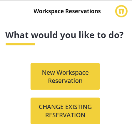
Building a Power App With A UX Designer

Make your apps more user-friendly by focusing on what your users want and need to do with human-centered design.
Intro
With the advent of no-code/low code business app development, more people than ever are building applications, and many of those people lack formal training in app development or user experience design. One of my colleagues, Josh Everingham, recently posted an article about user-friendly design and after reading I realized that there is a great opportunity to apply some of the principles in his article to building Power Apps. In this post, I’m going to walk through a Canvas App that I recently worked on to see how these principles can make it better.
Don’t Distract Users
One of the first things pointed out in Josh’s post is that we should keep to the bare minimum of information needed on the screen, and that trying to fit everything in too tight can be overwhelming. Reducing the clutter and giving things room to breathe is helpful. It can provide natural separation and a clear path for the user.
1. Breathing Room
Right off the bat, we identified that many of the screens in this app needed more breathing room. In several cases, there’s just so much crammed on the screen.
The first thing we did was remove the footer. Since many of our screens have a lot to pack in, we want to be thoughtful about what we include. It is pretty standard to include things like a footer, but in our case, the information offered in the footer is not very useful, so we can get rid of it to make room for what matters.
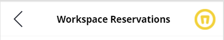
2. Header
Placement of header elements can provide balance. In our case, we had an issue caused by the need to include a back button in a “natural” location for the user, which squeezed our logo placement. Moving the logo to the right and setting our app title was centered gave it symmetry and made it feel right.
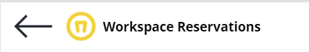
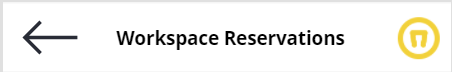
We didn't need such large icon for our back button, and felt like it could be simplified by using a simpler left chevron icon and make it smaller. Josh recommends 40-48px as a minimum size for a tappable area, so this did the trick.
Below is a before and after sneak peek of one of the more complex screens. As you can see these small changes to the header and footer created a significant improvement.
Breaking User Expectations…
1. Don’t Forget Native Device Function
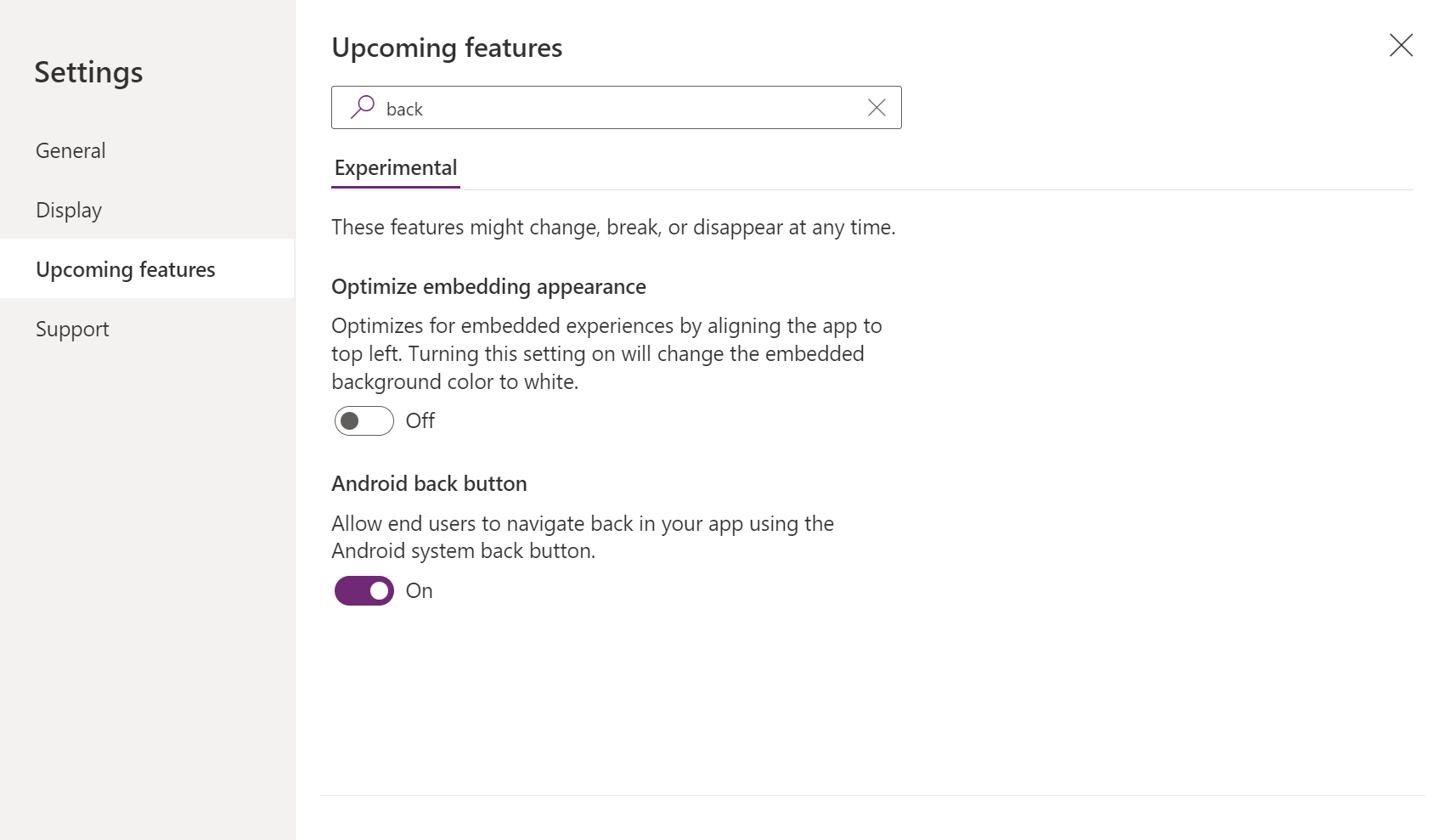
I think many Power Apps developers don't always consider what the experience is like on a mobile device. Since we’re primarily living in the desktop world when we’re creating, we often test or validate by simply using the play function of Power Apps Studio, and may not think about things like native device functionality. For example, what happens in our app when the user presses the Android back button? In our app it was a pretty big problem because if the user touches the back button on their mobile device after having gone through a few screens to select our workspace, it executes the back button of the web browser, which completely dumps the user’s session and they have to start all over again. No good!
The good news is that Power Apps has a preview feature to allow users to navigate back in your app using the Android system back button.
We should always try to consider the built-in functionality of our target devices and be looking for the best ways to work with them.
2. Clickable/Touchable Things Matter
Next, we should remember when building for mobile, clickable things are touchable. When building Power Apps, particularly Canvas Apps for a mobile device, it’s very easy to overlook little things like this. When we use the Power Apps gallery view, you have to press the icon on the right side to perform the action. Josh pointed out that we should make the entirety of the gallery item actionable. This makes perfect sense, we want the user to be able to touch anywhere on that item.
This simple change is a big deal. If possible, we want our users to be able to use our app with one hand. Whenever we have actionable elements that take the full width of the screen, we should make all of that space tappable. In our scenario, the selection of the items was easiest for right-handed users.

We can fix this by simply adding a button to the gallery item, making it transparent, removing the text and border, and then adding the action to the OnSelect property for the button. To be safe you can even group your icon, button, and text.

Now the user on a mobile device can tap the entire gallery item. And notice now when playing the app on your desktop that the entire area becomes 'clickable' and is indicated by a change in the cursor.
3. The Primary Color Used to Focus the User on the Primary Objective
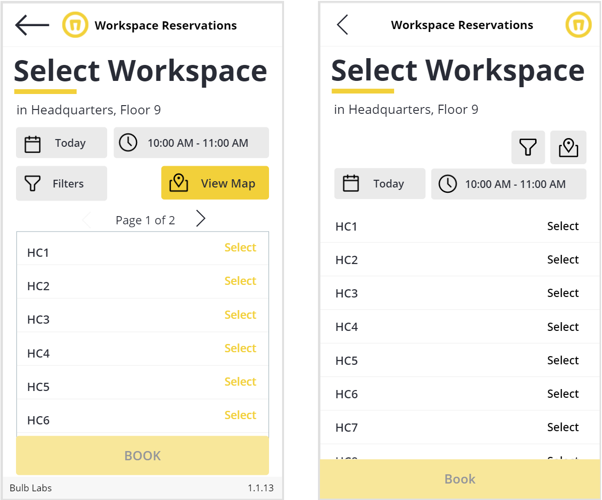
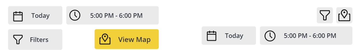
Another thing we should pay attention to when it comes to user expectations is that a primary color should signal the primary objective for the user. On our Select Workspace screen, we have a lot going on. We’re giving the user options to change the booking date and time, filter based on amenities, view the workspaces on a map, and ultimately book the workspace.
The first issue we have here is two buttons have the same primary color View Map and Book. The primary objective is to book the workspace so we’ll make the map the secondary button color.
.png)
Additionally, where icons are sufficient, we can eliminate text. In the case of our filters and view map button, the icons are recognizable on their own, so we can remove the text to gain some real estate here. In the case of our date and time selection, we’re also using this to indicate the current selection to the user so we’ll keep the text there.
4. Eliminate Paging If Possible
In this scenario, if we have a large number of workspaces that may cause performance problems if we load them all at the same time, the need for pagination might override this, but with a small set of data we can afford to eliminate it.
Finally, we can hide the Book button until the user has selected a workspace.
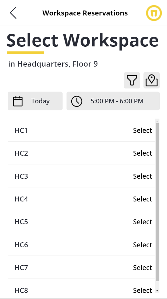
All of these adjustments give us more room to display the workspace options to the user in the gallery and better meet the experience expected by our users.
The final before and after can be seen here and it’s a pretty big difference.
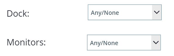
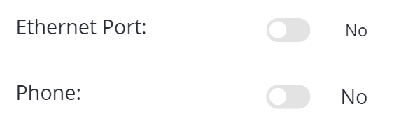
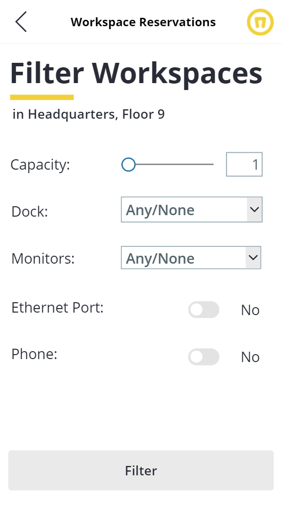
5. Use a Common Pattern and Clear Choices When Defining Filters.
Another fairly complex screen in our application is our Filters screen. Originally we tried to be a bit creative with this screen and use icons to toggle a few settings. But what we did was create a new pattern for filtering content that frankly was not a common or intuitive pattern.

So to make this better, we changed things quite a bit. In our changes, we are going to stack filters vertically and we won’t assume users will interpret our icons. Where it’s not obvious it helps to spell out clear choices. Here are the detailed changes:
We made Capacity a slider instead of a dropdown.

We defined clear options for Dock and Monitor availability instead of our toggle icon.
We also made Ethernet Port and Phone availability simple Yes/No toggles.
And finally, we stacked and aligned our controls.
Gestalt Principles
One of the more nuanced topics in Josh’s post is the piece about Gestalt principles. I found this interesting because it speaks to how our brains work and process information. Simply considering what things are like each other or how they relate to each other on our screens can have a big impact on the user’s experience.
Proximity
We made a simple change on our Floor Selection and our Workspace selection screen to move the information that had been selected closer in proximity to our screen title. This gave it separation from the rest of the information on the screen but also made it a more prominent cue to the user. In the example below it's very clear that moving the "in Headquarters" text up makes it clear that the user is "selecting a floor in headquarters" simply because they are close to each other.

Accessibility
The next area we’re going to touch on is accessibility. This one is really important, but certainly not something that is always considered, especially if you lack formal software development training.
Title Case for Button Text
I like this one for a couple of reasons. One, this type of thing is not top of mind for most folks building Power Apps. And two, because it gives us an opportunity to consider our users. Understanding that people naturally rely on letter shapes to quickly recognize words, highlights the difficulty we may introduce if we have all caps on our buttons as we do. This is especially important for people with dyslexia. Notice how much easier it is to read the top button than the bottom button? HOW WOULD YOU LIKE TO READ THIS BLOG IF IT WAS IN ALL CAPS?
Color Contrast for Accessibility
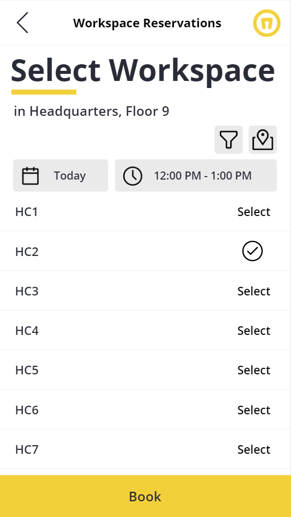
Another accessibility item identified was on our workspace selection screen. Here we have the option to select a workspace and the selection indicator (icon) as yellow on white. Yellow being our brand color, we kind of chose that as the priority, not considering the accessibility challenges it might create for someone who is visually impaired.
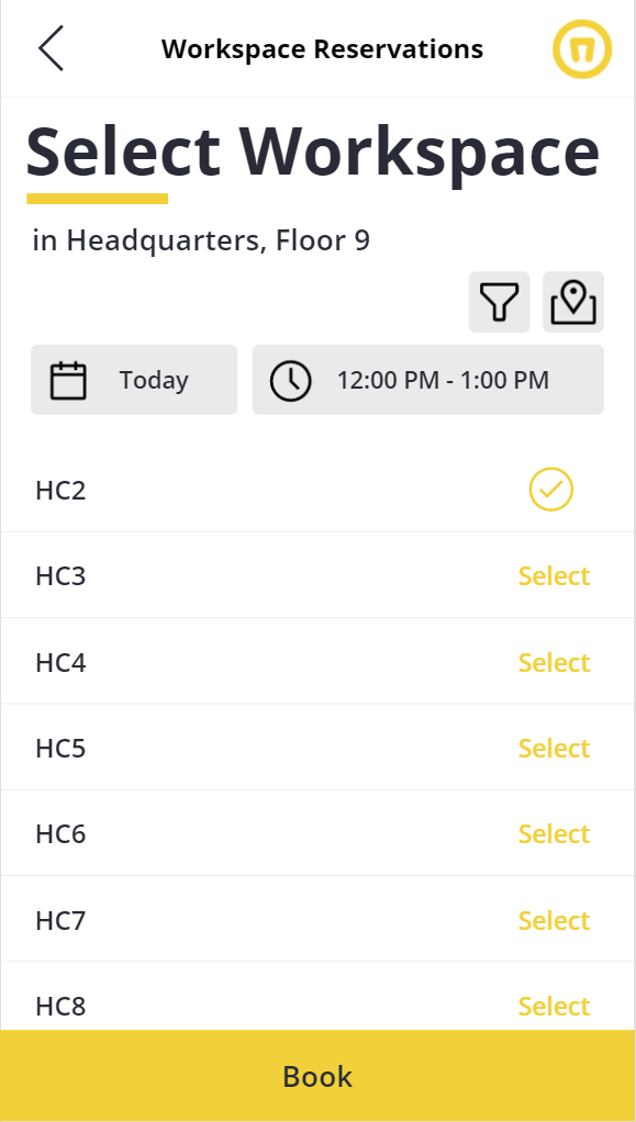
So we simply fell back to our black-on-white background option to make it better. It’s clear enough that the user should select a workspace and now with a black selected icon, it’s also clear which one is selected.
Conclusion
As Josh pointed out in his post there are several things we should consider when building user-friendly apps. I hope this post helps point out first, that we shouldn’t take these principles for granted simply because we’re using a no-code or low code option. And second, I hope this helps show you how you can apply some of these principles to your Power Apps.
SELF ASSESSMENT
Is your business getting full value from your M365 subscription?
Billions of dollars are wasted each year on underused subscriptions. Take 3 minutes to find out where your tools are driving results, and where they’re holding you back.
Find Out Now

Is Team Communication Holding You Back?
Find Out in Just 2 Minutes.
Take our quick scorecard to uncover communication gaps and hidden barriers within your team.
.jpg)