.avif)


Create a Canvas App From A Figma Design

If you're looking to become more effective when building apps then no-code/low-code is a great place to start. Microsoft has even added some new features that make building apps even faster.
Overview
Microsoft added some new functionality to Power Apps that gives you the ability to generate Canvas Apps from a sketch or a wireframe drawing, and also, from Figma design file.
This new functionality offers two huge benefits. The first and probably most obvious is Power Apps can generate screens for your app from a drawing or design. This simply saves time. The other big win here is the time saved and beautiful end result when you have a UX / UI design team, and you need to build an app based on their concept.
In this article I’m going to focus on creating an app from Figma because it has the most value for organizations and teams who are building apps.
First we'll show you how to create the app, and then run through some of our thoughts on the process.
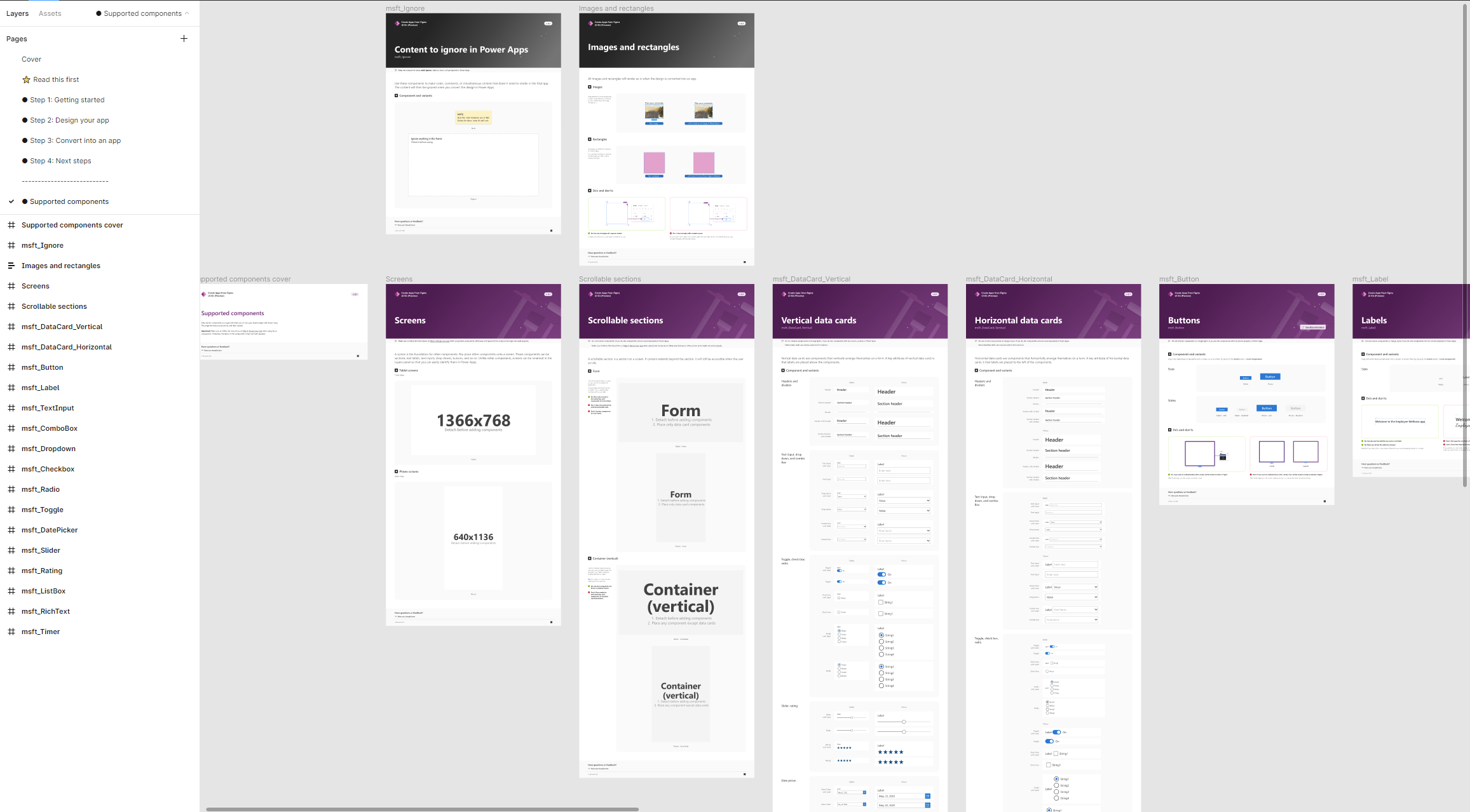
The UI Kit
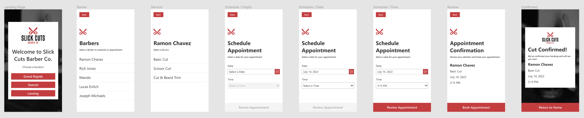
Microsoft put together a Figma UI Kit to get started in Figma here. We sent it over to our favorite UX designer Josh Everingham to build a simple concept for a barbershop scheduling app designed for mobile, and make it beautiful.
The template comes with some guidance to walk you through what elements can be used and what features are supported.
Below is the design Josh put together for this proof of concept.
It’s not just a grey app with text and buttons. He spent a little time with some custom graphics, choosing colors, and creating an intuitive experience for the user. He made this design actionable, meaning he can share the concept with stakeholders, they can touch, click, and experience the app from “Welcome” to “Cut Confirmed”, before it’s actually built.
Creating the Canvas App
Alright, so now let’s get into what it looks like to generate the Canvas App from Josh’s concept. The first thing I will say is Figma is not my native land so I had a small learning curve there and here is what I found.
First, if you don’t have edit rights on a Figma design file you can only copy links to specific frames within the design. This will basically give you a single page canvas app. It works but it’s not the desired intent if you have multiple frames in the Figma page, or in our case a full application concept.
So you can either ask your designer for edit permissions or in my case I copied the design file into my drafts and then used that file to generate.
With the right permission you can copy link to a page and then you get all of the frames in your design. Each frame is created as a separate screen in your Canvas App.
Another thing I noticed is that the screens are created in the same order as they are defined in your Figma page. By order, I don’t mean the layout or flow in the concept, I mean the order in which they appear in the list of frames on the Layers panel in Figma. So, if you have a landing screen that you want users to see first, put it at the top of your Figma page in terms of order.
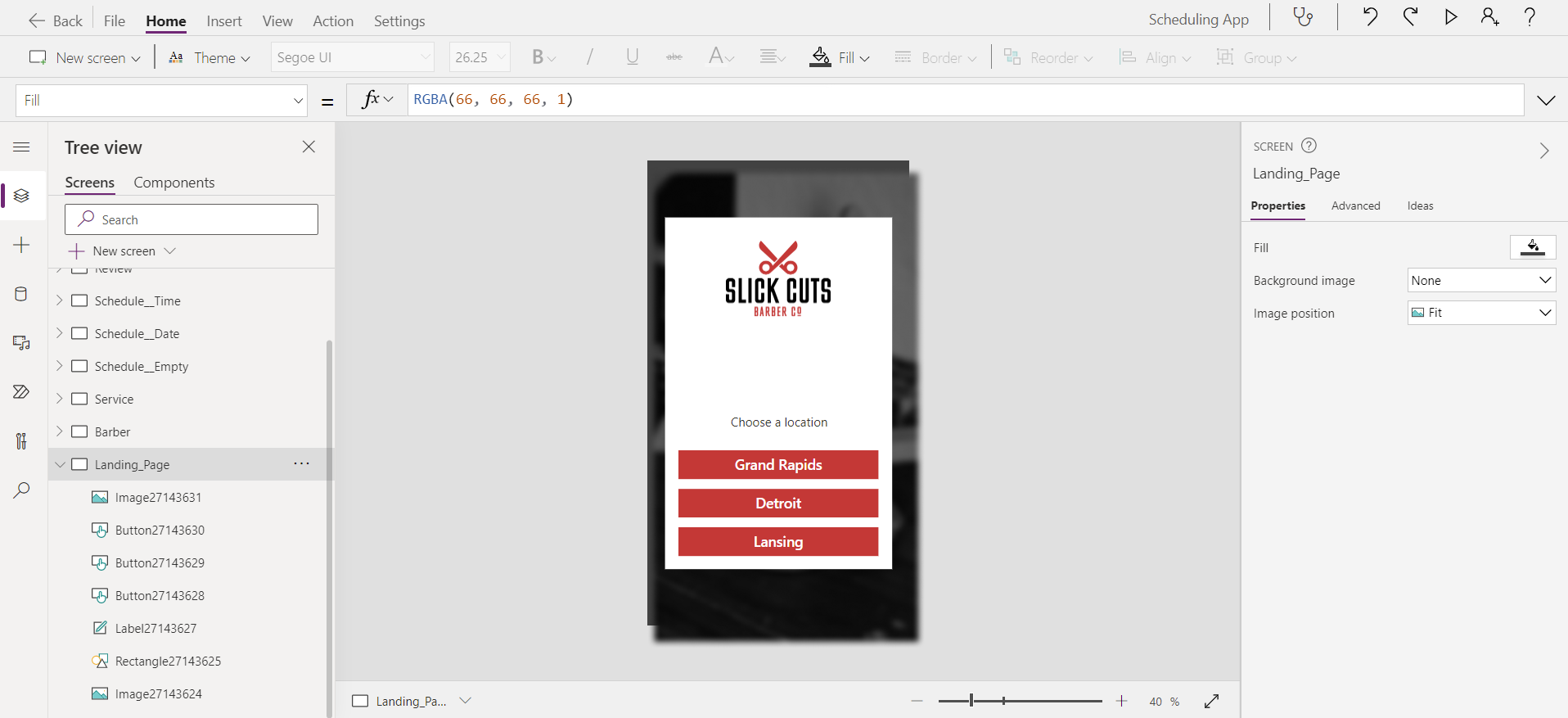
Canvas Apps Tip: Remember by default the start screen in Power Apps is always the screen at the top, unless you specify one in the StartScreen property of the App Object.
What’s Next?
Once the app is created, there is still work to do to make our application functional. Some of these things could potentially be resolved by tweaks to the design file. Others are simply things you will have to wire up or configure in your app.
In our case here is a quick list of what we had to resolve:
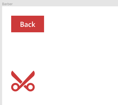
Button Text / Cut off
In our app we have a back button in the upper left corner. When generated in the Canvas App, we found this button was generated with too much padding on the left and right, causing the text to be cut off. Simply adjusting this padding was an easy fix. Without doing too much digging I suspect this to be some kind of translation issue. The padding set on the button was identical to the left and right padding set in Figma, so there’s obviously some kind of scale difference there.
Figma
Power Apps

Hover / Action Colors
If you’re familiar with building Canvas Apps, then you know that there are a number of color or fill properties on every control. In this case the button controls were created and their fill was set to red. However, all of the “secondary” or action colors were set to the default. So when you hover or click a button we got a different color, which is not what the designer intended. In our case the design simply called for red, no other behavior.

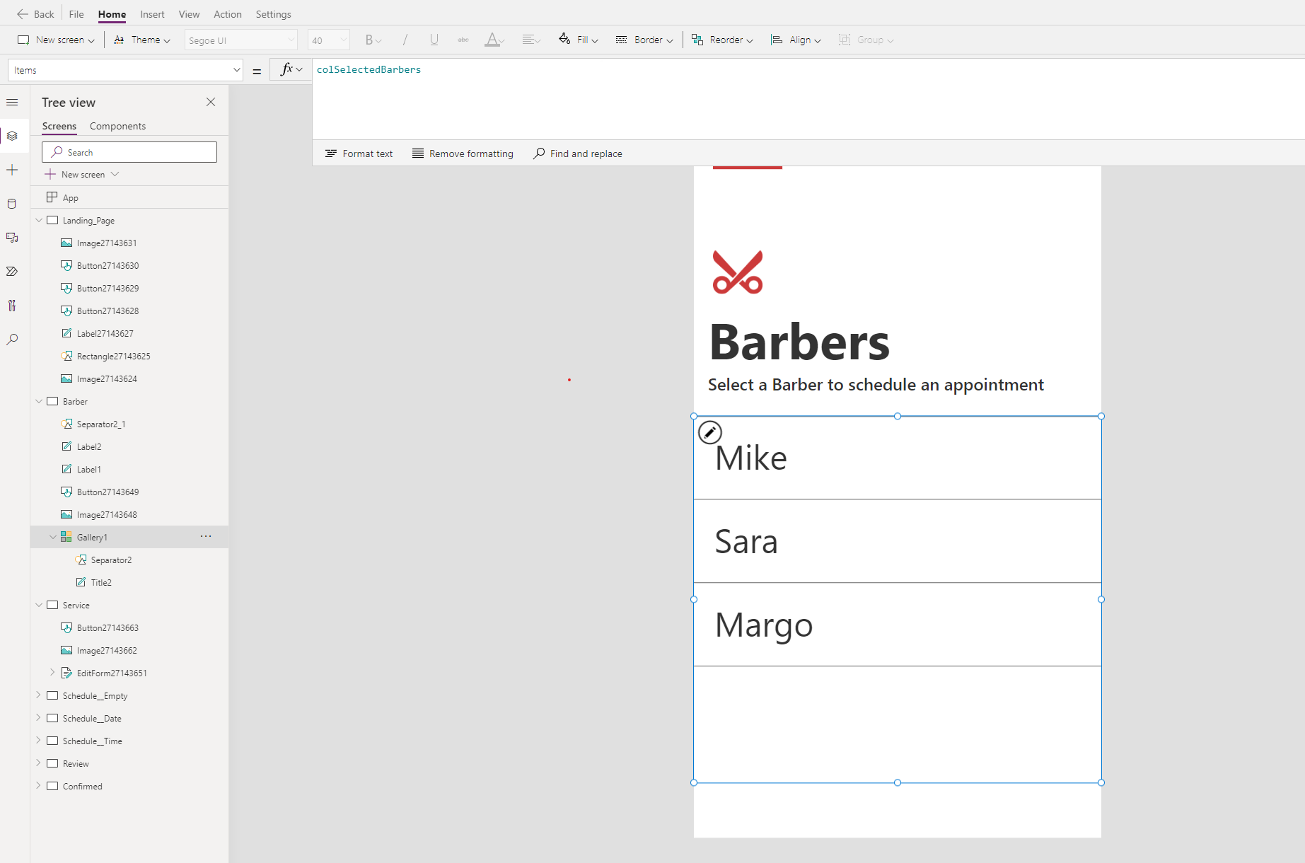
Gallery Support
Nope, not really. Figma gives you options for a couple types of scrollable containers, Form and Container. Neither of these have a great option that translates directly to the Gallery control we use in Canvas Apps. In our concept we have a couple screens that provide a list of choices. In the Canvas App world these are best done with a Gallery control, so this is one of the areas where we simply have to remove the generated controls and replace with what is needed.
Productivity Tip/Thought: Whenever you have to rebuild a screen in this way, it would be nice if we had our look and feel defined for the app. Starting from an App Theme Template would be helpful here. Of course, the key to making this beneficial is to have your Theme Template in sync with your Figma design. I wonder what it would take to generate a Canvas App with theme templating applied, from Figma?
Rebuild / Recreate Forms / Screen Content
So now we know there will be some screens that need to be reworked, content recreated in a way that makes the app functional. I think this is just something that you should plan on.
Connect / Create Data
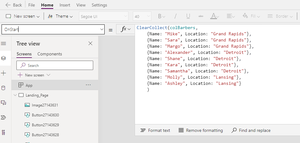
This one may seem obvious but it’s definitely worth mentioning. If your concept has any kind of data model aspect, you’re going to have to implement it. Whether it involves lists of data coming from SharePoint, Dataverse or somewhere else, you’ll need those entities, and you’ll need to wire up your galleries and forms to connect to them. This is probably the most labor intensive part of the whole process.
Recommendation: Follow along with your designer or design team to plan your data model, so it is ready when you create your app.
Wire Up Navigation

Ok, so this is one I actually did not expect. For some reason I had it in my head that Power Apps was smart enough to generate some basic navigation functionality inferred in the Figma design. Welp, it does not. Or at least it didn’t in our scenario. It’s not a huge deal, you just need to do it yourself.
SELF ASSESSMENT
Is your business getting full value from your M365 subscription?
Billions of dollars are wasted each year on underused subscriptions. Take 3 minutes to find out where your tools are driving results, and where they’re holding you back.
Find Out Now
Is Team Communication Holding You Back?
Find Out in Just 2 Minutes.
Take our quick scorecard to uncover communication gaps and hidden barriers within your team.
Tips To Save You Time
Based on what I learned through this process, I think there are a few things that can help make this new capability more valuable and save you time.
- Take whatever guidance you can from the Power Apps from Figma UI Kit that you can. It’s going to help Power Apps create screens and controls that make sense in Power Apps.
- Pay attention to the order of your frames in Figma. Getting them sorted is way easier in Figma than reordering screens in Power Apps Studio.
- App developers or makers should be involved in the design so they can plan and be ready with a data model.
Thoughts from Josh Our UX Designer
Q: I noticed Figma has a getting started guide. Did you use it? If so, did you find this helpful?
Josh: I did use the getting started guide. it was not terribly intuitive from the perspective of a designer. I was able to get things right my first time but it is hard to tell what features of Figma work with this plugin.
I followed and referred to the guidance often.
Q: Were there any places where you felt the guidance was confusing or could have been better?
Josh: I feel that the guidance needs to be clearer about what Figma features are usable. I abandoned a lot of best practices for Figma out of caution. for example, they never mention whether or not Auto Layout is available. It is always bad practice in Figma to use shapes for backgrounds and for cards. Anything not scaling with Auto Layout is inefficient and bad practice. They don’t ever once mention Auto layout, and ask users to use rectangles for cards and for backgrounds.
Q: From your point of view, what are the benefits of creating a Power App from a Figma design file?
Josh: The benefits are that it is easy to prototype and make something quickly without needing to know Power Apps, and it is always faster to prototype in Figma than in development.
Q: What drawbacks do you see to this approach?
Josh: This plugin sort of kneecaps users who have experience with Figma AND Power Apps. If you are proficient with Figma, you are using an inefficient workflow to make it work with this tool. Figma power-users are not using rectangles for the backgrounds of cards or manually dragging objects to determine spacing, they are adding fills and/or strokes to auto layout frames and determining paddings and margins with auto layout. It feels like I am forgoing all of the benefits of Figma to get the app to work with Power Apps.
If you're proficient with Power Apps, many of the specialized features and components are not available for this tool and you have to add it manually after the fact anyways. It’s limiting both to Figma users and Power Apps users and while maybe it is a good starting point, I don’t see why transferring these to Power Apps this way is all that useful.
I think giving the visual components for Figma and manually then making the app in Power Apps might give better results, though they may not be as fast to do so. I don’t think this tool is great for teams with both designers and developers, and frankly, I’m not sure the Figma subscription is worth it for someone who isn’t a designer just to be able to prototype quicker.
Q: Any final thoughts?
Josh: Keep in mind, I do not use Power Apps. I spend nearly 40 hours a week in Figma, so I use all of the shortcuts and features and tools, and I felt very hamstrung by this process. It helped me understand Power Apps a little bit more, but I don’t think my knowledge based on this experience alone is deep enough to dig into Power Apps myself.
Overall Benefits
We’ve walked through what it’s like to create a Canvas App from a Figma design. And so far we’ve highlighted the things you might need to do, or the pains you might experience.
We can’t forget to mention the benefits and the things that will save you time, so let’s quickly point those out here.
- The App structure & screens are created for you. This is a huge time saver, especially in the case you have a complex app or a significant number of screens. I know this is valuable because of the amount of time spent creating components and theme templates all in the name of making it easier and faster to create the next screen and the controls on that screen. While this may not be a theme template (yet), or componentized, maybe it doesn’t matter if all of my screens are created and 80% of the look and feel is there.
- For the most part, the UI Kit created an app that was as designed. It honored the design that Josh created. So when it comes to the effort needed to tweak controls, create components, import images, that was all done for me. So instead of starting with “basic” screens and making them beautiful, I get to start with beautiful screens and just wire them up.
Helpful Links:
- Overview of creating app from Figma (preview) - Power Apps | Microsoft Docs
- Create a canvas app from Figma (preview) - Power Apps | Microsoft Docs
- Design your app using the UI kit (preview) - Power Apps | Microsoft Docs
- Troubleshoot common errors when creating app from Figma (preview) - Power Apps | Microsoft Docs

.jpg)