Exploring the Asset Checkout Canvas App Template

Learn how you can set up your own Asset Checkout App with your Office 365 subscription.
Intro
When it comes to shared assets at an organization, managing availability and keeping track of what employees need in their day-to-day jobs can be a real headache. Not only do most companies have to service and allocate equipment out for individual needs, but they also need a process that tracks how those assets get back for continued use. Fortunately, PowerApps already has a template that acts as a great jumping off point in managing a critical business process like this. In this article we explore the Asset Checkout application template to find out what it does, how to deploy it, and some tips on how you can customize it further for your business practices.
Getting into the PowerApps Environment
Power Apps is relatively new compared to other tools in Office365. We call it a low-code/no-code environment of apps, services, and data connectors that allows you to quickly build custom apps for business needs. It’s one of the simplest and cheapest ways to build an app because it comes with Business Premium, Business Essentials, F1 Plan, and the E1-E5 Enterprise Plan licenses.
Getting to Power Apps is pretty easy if you’re already familiar with Office365. From any environment in O365, click the waffle at the top-left and look through the Apps list. If you don’t see it immediately, you can expand All Apps at the bottom of the list and search alphabetically. If you don’t see it at all, you may want to check with your IT person about the licensing at your organization.

The Power Apps homepage is an aggregation of four key areas. You can start with a data source, create an app from scratch, dive into a learning module, or review the existing apps within your organization. Each of these sections in the environment has its own landing pages that shed more light on how you would start building an app at any of their stages.
From my perspective, the “Make Your Own App” section on the homepage seemed to be the most basic level to begin with. Instead of creating something from blank, off to the side, you see a link to All Templates.
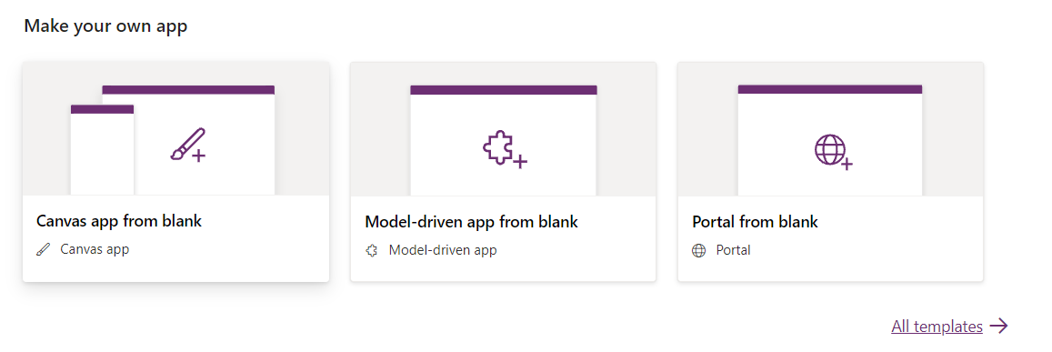
If you pick +Create from the home menu, you’ll also notice that the templates are showcased at the bottom of the page. But before we select a template, it’s important to understand the difference between canvas apps and Mode-driven apps.
Canvas Apps vs Model-Driven Apps
Templates or blank apps can be created in these two different ways. If you’re not a traditional developer or coder like me, the Canvas App route is the way to start. Canvas apps are built from a blank canvas by dragging and dropping elements onto a page, so you get to illustrate the look and feel of the application without having to write any code. This style is best suited for mobile devices and tablets and it isn’t restricted to a particular data source.
Model-driven apps are a design approach where the existing or underlying data determines how the application is laid out. Adding components and integrating data sources like Dynamics 365 or Common Data Source (CDL) designates how the application looks and operates. Model-driven apps can be so complex that you can embed canvas apps within them. Since most beginner users like me don’t have data ready or don’t know how to connect it to Power Apps yet. I choose to avoid the model-driven approach for now.
Starting from a Template
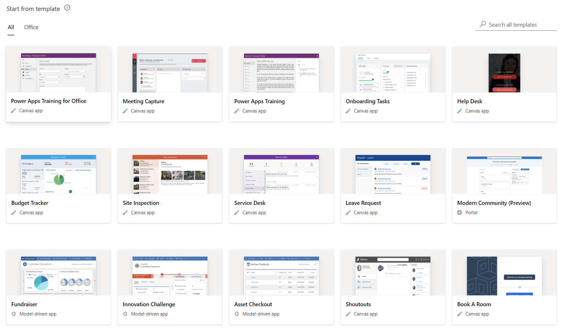
Expanding the all templates list highlights all of the templates with a thumbnail and calls out which ones are canvas and which ones are model-driven. The Asset Checkout template is available in both approaches, but I selected the canvas app that is listed farther down the list.
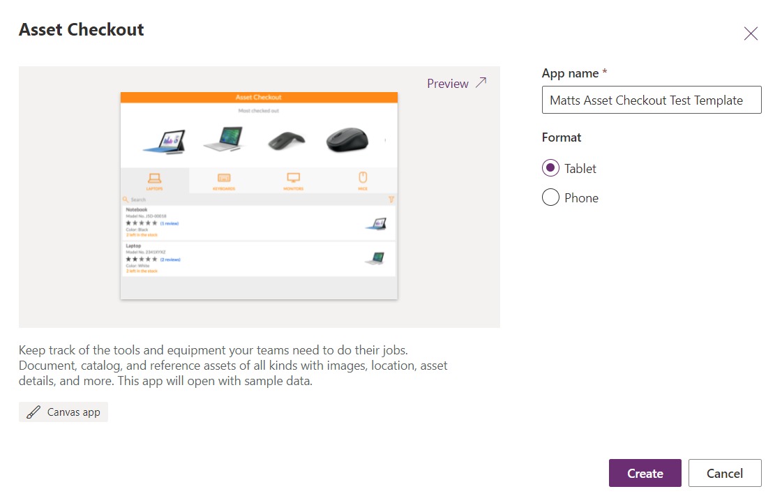
Before Power Apps opens the template for you. You need to give it a unique name and determine the format you want the app to display in. Giving the app a unique name is important if users in your organization have unlimited app creation access and your team plans on utilizing multiple apps in your environment.
When you click create, it will take a moment or so for Power Apps to set up the interface for the template. When finished, you should see a layout that is reminiscent of a word document or PowerPoint template. There is a classic toolbar that runs across the top that manages the app file, elements within the app, data connected to it, and other settings. To the left is a tree view that breaks down the “skeleton” of the template including the various screens within the application and the objects that make up each screen. When one of these elements is selected, the properties panel to the right displays the field and data for each.
Before doing anything with the app, I highly recommend pressing F5 or clicking the play button in the top-right of the toolbar to demo the app from a user perspective. Exploring the app for its functionality first will quickly give you the best explanation about what the application does and how all of the data and design is connected before looking at specifics in the tree view. It was less overwhelming when I realized that there are only a handful of screens that do one or two different actions at the most and then the rest is just displaying and sorting data. Having the underlying knowledge of how the app operates makes drawing the connections between the data and its representation on the app makes it much easier to wrap my head around building one.
First Impressions
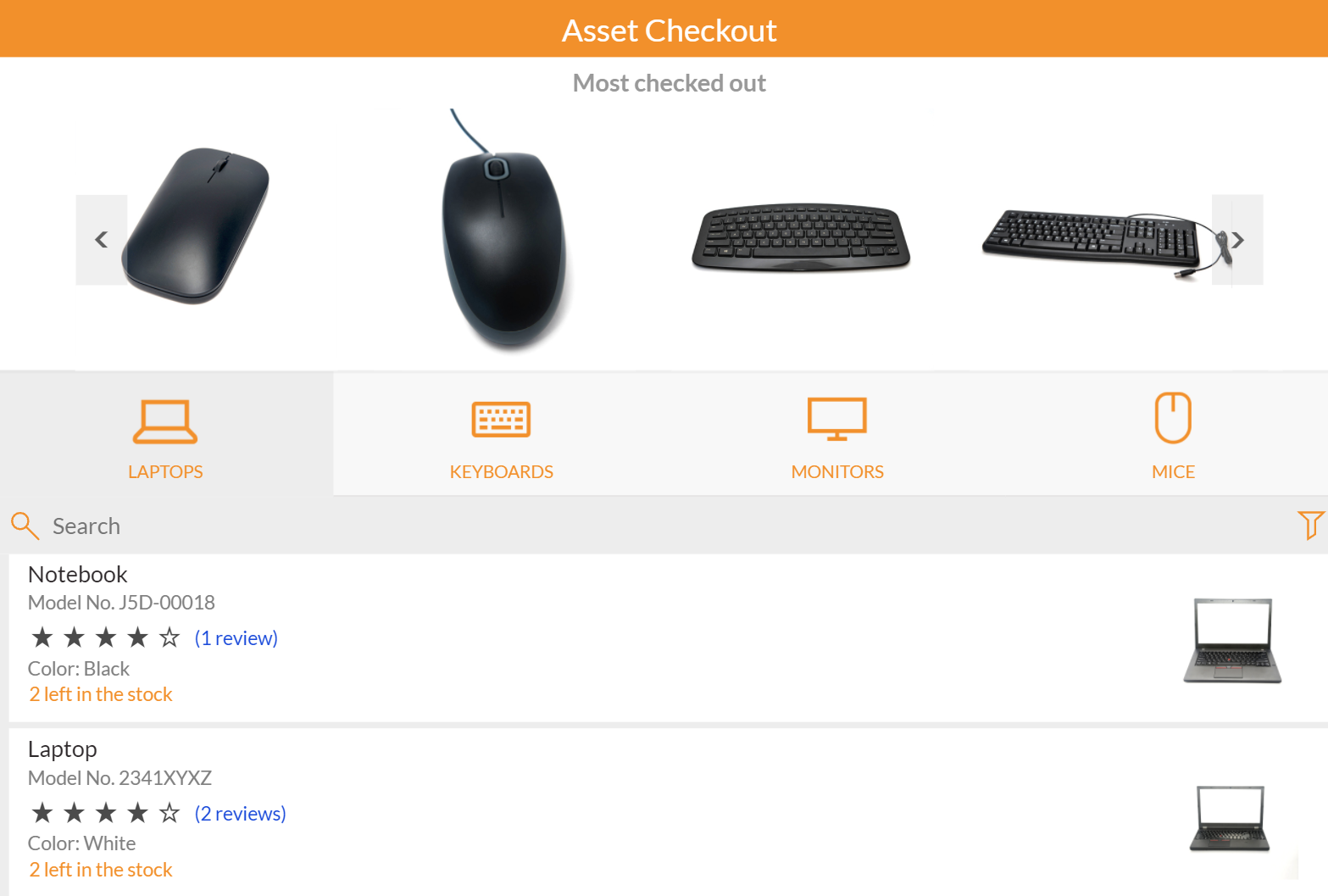
When demoing the app for myself, it was clear from the landing page that there was a specific purpose and routing for the user to take. This app is about checking out equipment or gear at an organization and there are classifications and limitations (stock) of those assets. A breakdown of the app welcome page highlights a handful of things for the user to consider:
- Aside from the title of the application, the first thing displayed is a carousel of company assets that are sorted by most checked out. This means two things: use of the assets is in itself recorded data and used to prioritize the display of the assets. Also, the app assumes that a shortcut to popular equipment could be used here instead of digging further into the app.
- In the middle of the landing page are categories that assets are classified. These category thumbnails are filtering that, when clicked, refine the asset listing at the bottom of the page. This also means that data about the assets themselves are used to group or filter to help users find something specific quickly, or just to explore other alternatives of equipment they may need.
- The asset listing comes with a search bar that matches keywords with the asset title only. A filter to the right toggles the sorting from most checked out to highest reviews, which I assume is an average across the multiple reviews.
- Assets themselves display as rows with the title, model number, number of reviews and an average, color scheme, thumbnail preview, and the number left available to checkout. Selecting the review will pull up all reviews on the asset while clicking anywhere else in the asset row refreshes to a checkout screen.
Once you pick an asset to checkout, a screen for that asset displays even more information and repeats the same content as before on the home screen. This makes sense to have dedicated screens for each asset since there could be a lot more technical information that the user cares about before clicking the checkout button, but it’s also important to remember that only one app screen is created for all of the assets to utilize within the application, so all of the properties pertinent to each asset needs to align with each other.
The form to fill in to check out an asset is basic. You just need to put in a name, email, and timespan. I particularly appreciate that the checkout form is built on the asset description screen, so instead of jumping to a new screen and forgetting what you were about to checkout, it just refreshes with the fields needed to reserve. It’s clever that the app also allows the user to dictate their reservation by the number of days or months. I’m interested to learn how the app takes in that format and calculates the reservation time, later on, it’s handy (and critical I think for organizations) that the app spits out the date to return the asset to the user when it confirms the reservation.

Once all of the stock for a specific asset has been depleted, the checkout button on the asset page becomes inactive. When an asset goes out of stock on the app, it doesn’t drop from any filters or screens, which makes sense considering they’re sorted by either rating or relevance of use. The streetlight color coding on the stock capacity for each asset displayed certainly helps curb potential eye strain when searching for an available asset in larger lists.
Creating the App with Data
Although I deployed the template in the PowerApps environment, it took me a moment to realize that there wasn’t any real data connected to the template. The giveaway was that a yellow bar running above the canvas points out that you can make your own version by connecting the app to data storage with a button to make your app. Picking the view tab from the ribbon and selecting data sources opens a flyout that shows a handful of inaccessible excel files that Power Apps put mock data into to make the template functional.
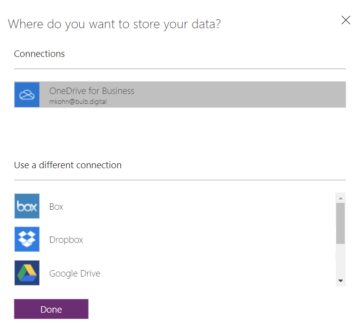
When you pick 'make my own app' you have to decide where your data for the application is going to live. These can be business connections or independent storage like Dropbox. At this time the most basic option and the default choice is to select your OneDrive for the Business environment. This is the best option to start since everyone views OneDrive as a “catch-all” for data that they haven’t specified a true home for. In this case, I’m surprised I didn’t get the option to pick a SharePoint site collection since I’m most familiar with that app in the O365 suite, but I’ll probably look into that in my next blog.
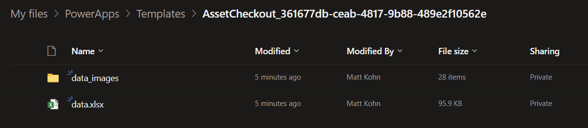
The first time OneDrive is optioned to host data for Power Apps, it automatically creates a PowerApps>Templates folder and then a subsequent folder for each app that has data connected. Each of these template folders has an excel workbook and an additional folder to store the data images that display in the app.
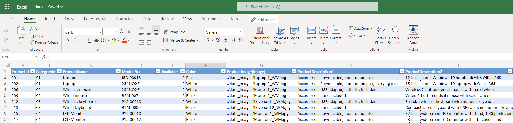
The excel workbook holds all the data for the app aside from the JPEG images. It has a sheet to maintain categories (with a category code for each classification), products (which are the assets with their current stock recorded), user reviews, and assets (which are the history of reservations made). The labeling is a little confusing because the datasheet refers to the reservations of the equipment themselves as ‘assets’ whereas I would just call that sheet “reservations“ and then call the product sheet “assets.”
While it can be difficult for a first-time user like me to understand the right capabilities of the app to the data and vice versa, I do see the changes in the data workbooks when using the app now that it’s been connected to a true data source. I can also edit fields in the workbooks and refresh it in-app to “reset” the data which can come in handy after an extensive testing period before launching an app to the rest of the organization.
Summary
Overall, this is a pretty good app to begin getting comfortable with if you’re new to Power Apps because it has an explicit function and purpose with minimum data variables. Exploring a multi-sheet Excel workbook as the back end of the data source helps illustrate that it takes more than just one table of data (or a SharePoint list perhaps) to enable asset reservations that are claimed and reviewed by users at an organization. Adding any more data points like submissions for broken equipment or requests to increase stock would have most certainly been information overload on my first exploration of the template.
I’m still getting familiar with how the application tracks outstanding reservations and what happens to the data when time is up on those dates. I expect a macro in the workbook or functionality in the app to trigger assets to become available after the reservation “expires” but it may be handled further within the application. Users that are thinking about customizing this app for their own use will want to think about the business process flow that needs to happen physically alongside the apps use. Just because a user makes a reservation for equipment doesn’t mean that they know where to go to get it. In the same fashion, just because a date passes for a reservation doesn’t mean that the user is aware to return it to inventory without some power automation or alert system in place.

SELF ASSESSMENT
Is your business getting full value from your M365 subscription?
Billions of dollars are wasted each year on underused subscriptions. Take 3 minutes to find out where your tools are driving results, and where they’re holding you back.
Find Out Now
Is Team Communication Holding You Back?
Find Out in Just 2 Minutes.
Take our quick scorecard to uncover communication gaps and hidden barriers within your team.
.jpg)