


3 Tips to Speed Up Your PowerApps Development
How To Build a Header Component For Your PowerApp

Managing standard elements across a lot of screens in a PowerApps can be time-consuming and difficult to get everything to be consistent. Components create a single editable instance of these elements that can be used on multiple screens. This creates one source of truth that you can drop on your screens and count on them all being the same.
An Overview
If you’ve worked with Power Apps at all you’ve probably created applications having multiple screens and figured out pretty quickly that you can speed up development by using the good ol’ copy and paste method. Insert a control, style it how you like, then when you need it again you can copy and paste it to a new screen. Maybe you’ve even gone so far as to create a “starter” application with a screen having a “library” of controls all formatted and styled to meet your standards. This method works fairly well. And if you’re applying brand colors and formatting through the `App.OnStart` method then you know that you can adjust the primary fill color and it will be applied everywhere that is referenced. But, if you’re using this technique to propagate the application header or footer to all screens in the application, there is an even better way… enter the `Component`.
Enabling Components
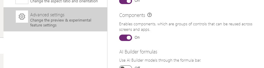
Let’s go ahead and build a quick header component and use it to demonstrate the benefits. First you need to ensure that you have components enabled for your application. To do this go to the application settings by clicking on `File -> Settings` and then choose `Advanced settings`. Scroll down until you find `Components` and ensure it is turned on.
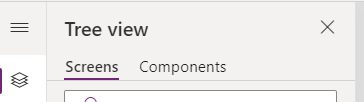
Once components are enabled, you will see a `Components tab` in the Tree view of your application.
Create the Component
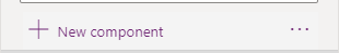
Next click on `New Component` to create our Header component and name the component `ApplicationHeader`.

Configuring Our Header
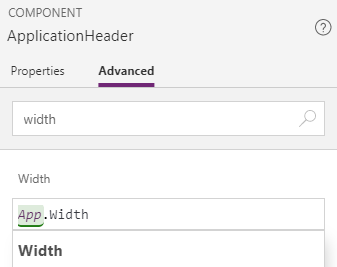
So the very first thing we want to do in our new component is set the size. Our header should have a height and width that meets the needs of our application. For our height, we’re going to start with `82` as that should give us enough vertical space for our logo and other things that we want.
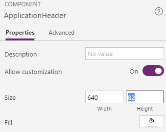
But for the width, it would be really nice if we could automatically adjust to whatever the application width is. To do this, we can set the width to a formula `App.Width`. This way, if we ever need to adjust the width of the application… the header will adjust along with it.
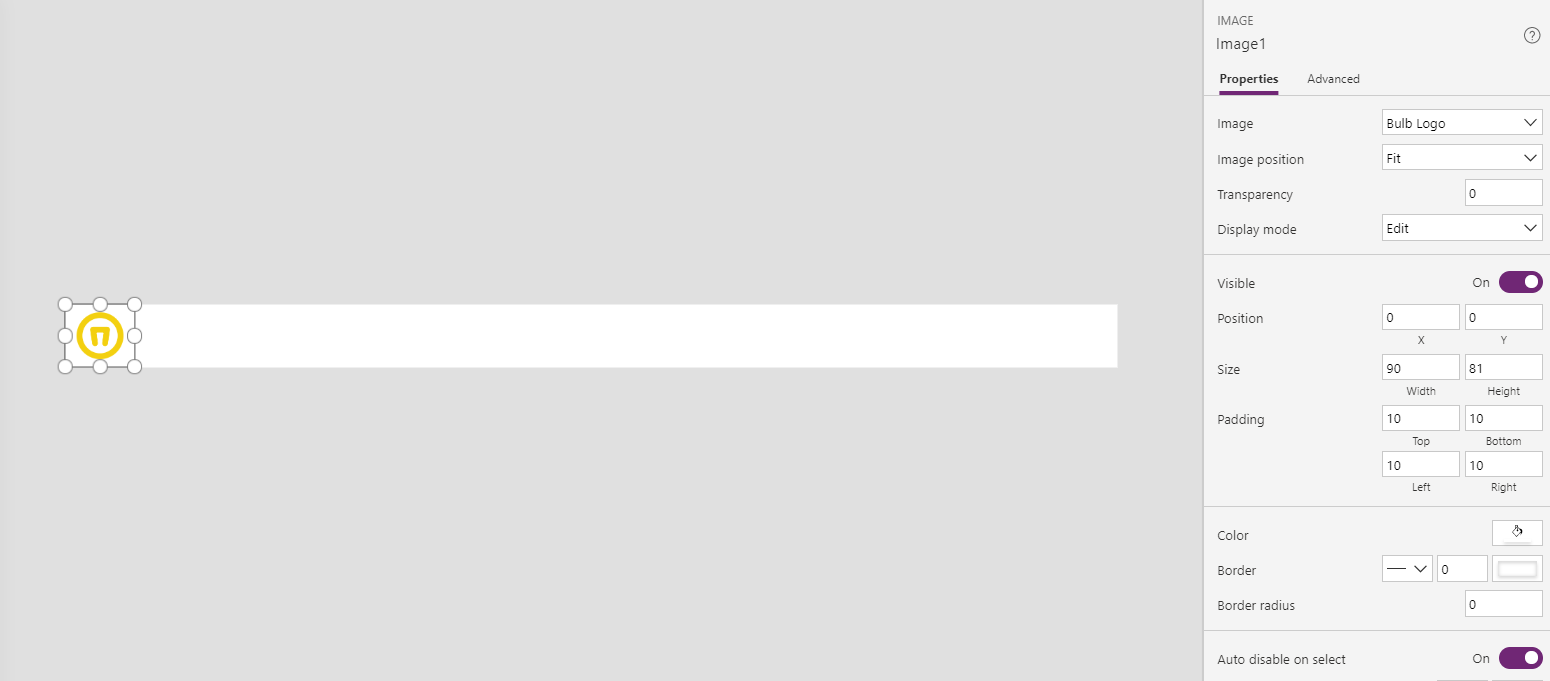
Now let’s add some things to our header. First we’ll add an image on the left side for our logo. You can add an image directly through the `Image control` if you’d like. You can also add images to the `Application Images` collection itself and these become available for use in any `Image control`. In this case I’ve set my Bulb Logo and also added padding to give it some space.
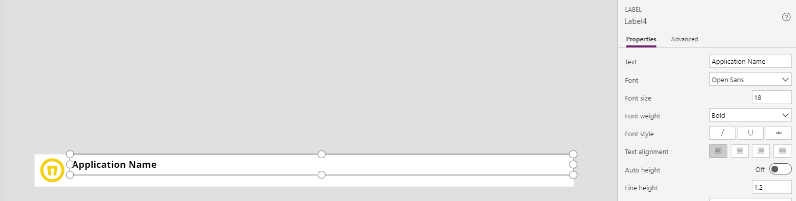
Now let’s add some text elements to the header. First we’ll add a `Text Label` for the `Application Name`. Set the text for the control, then choose font size `18` and weight `bold`.
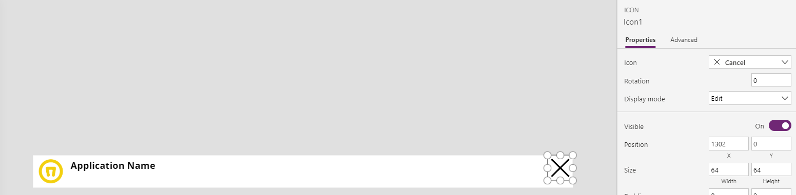
Finally, let’s add a `Cancel icon` to the header to be used to close the application. Add the icon, select the `Cancel icon` and then in the `OnSelect event` enter `Exit()`.


SELF ASSESSMENT
Is your business getting full value from your M365 subscription?
Billions of dollars are wasted each year on underused subscriptions. Take 3 minutes to find out where your tools are driving results, and where they’re holding you back.
Find Out Now

Is Team Communication Holding You Back?
Find Out in Just 2 Minutes.
Take our quick scorecard to uncover communication gaps and hidden barriers within your team.
Adding it to Screens
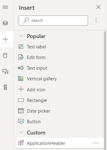
Now that we have a basic header component, let’s add it to some screens in our application. To do this select the screen where you want the header. Next, you can insert from the ribbon at the top. All components will appear under the `Custom` heading. Or you can use the `Insert` menu on the left, again all components will appear under the `Custom` heading.
Now that you’re using a header component, let’s make a couple changes so we can see the real benefit of the component.
Making Adjustments
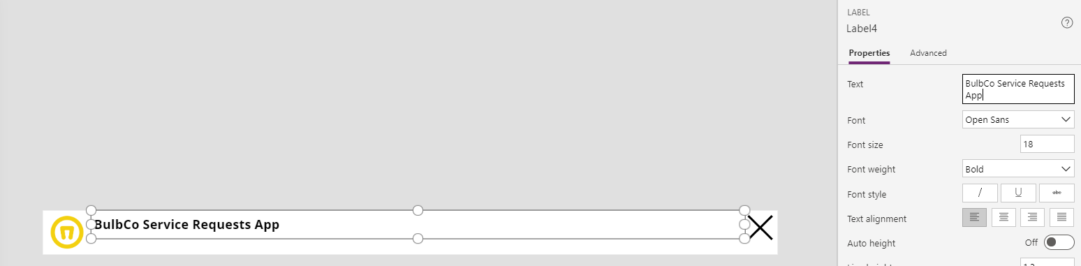
First, let’s say our business requirements finally solidified and we now know what the name of the application should be. Navigate back to the `ApplicationHeader` component, select the `Text Label` for `Application Name` and change it to something more relevant. Here I’ll change mine to BulbCo Service Requests App.
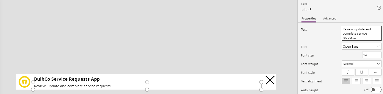
We also determined that it would be a good idea to include some secondary text describing the purpose of the application. To do this, add another text label below the `Application Name` and enter your special purpose.
Now, let’s go back and look at the screens where we’ve utilized the `ApplicationHeader` component.
All of the screens have been updated accordingly. Without the use of the component, we would have had to touch every single `Text Label` in every header of every screen to apply the change to the `Application Name`. We would also have had to copy and paste the `Secondary Text` label to every header of every screen.

.jpg)