


3 Tips to Speed Up Your PowerApps Development
How To Globally Style Your PowerApp

Now that you’re using a component to create a header on all screens in your application. What happens if you decide the theme or brand colors should change? If you’ve worked with Power Apps before you are probably familiar with the App OnStart options for setting up brand colors for your application. While these settings are readily usable in the standard form controls, it may not be readily apparent how to apply this same concept for components.
Use Component Parameters
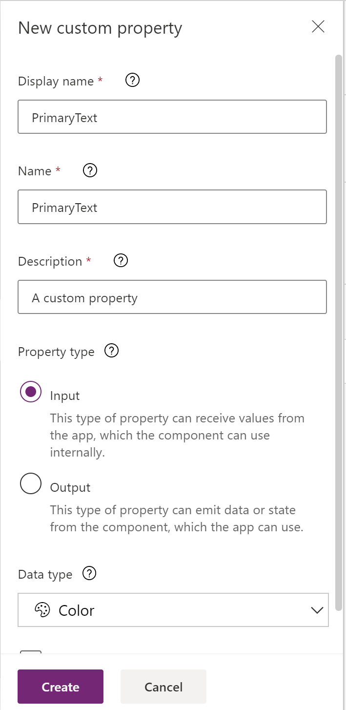
Enabling this is really quite simple. First, toggle Access app scope to true; this allows the component to access global variables that have been defined in your app. Next, the key things to identify are what elements you want the theme applied for. This could be as simple as background color and font color. The main thing standing in our way is that a component itself does not expose any color properties beyond Fill. Therefore, we cannot directly apply all of our branding colors to the component. To facilitate this, we can specify parameters on the component itself. We have options to create parameters for input and for output…. For our purposes we’ll be specifying a couple input parameters. We’ll create one for `PrimaryText` and one for `SecondaryText`.
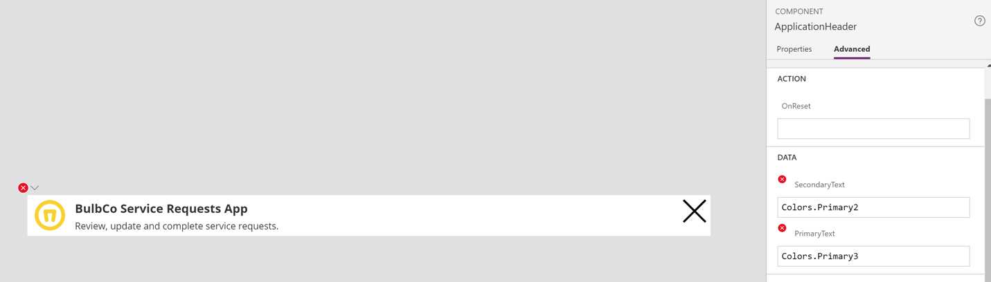
Click the `Components` tab from the Tree view and then select the `ApplicationHeader` component. In the component properties pane you will see a section for `Custom Properties`.
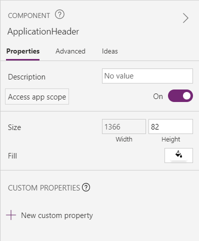
Add two new custom properties here for `PrimaryText` and `SecondaryText`. Both should be input properties of data type `Color`.
Wiring Up Parameters
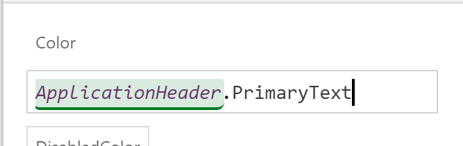
Next, select the `Application Name Text Label` and using the Advanced properties tab find the `Color` property and set it to `ApplicationHeader.PrimaryText`.
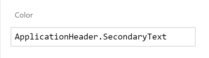
Now select the `Secondary Text Text Label` and set the `Color` property to `ApplicationHeader.SecondaryText`.
Now that we’ve created the custom properties and connected them to control properties within our component, we can apply these settings in our application.
Fast forward a few steps… I’ve applied my branding to my screens using colors set in the OnVisible property of the loading screen – we used to use OnStart, and have now moved over to OnVisible. Learn more about migrating from OnStart in our blog.
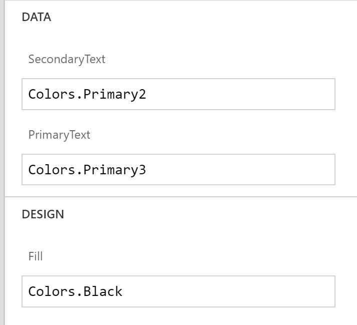
Now, select the application header component and set the `PrimaryText` property to a brand color you have set in your custom theme and the `SecondaryText` property to another color in your theme. In this case I’m using `Colors.Primary3` and `Colors.Primary2`.
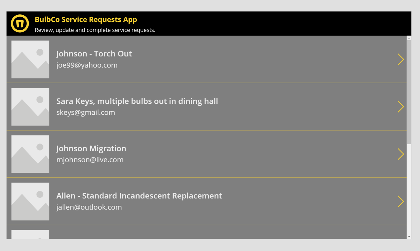
And now we see those colors applied to our `ApplicationHeader` component.
So now, we can effectively brand any `Components` we choose to create in the same way that we apply the brand elsewhere. Changing the brand colors in the `App OnStart` now applies to our components as well as the standard power apps controls.
SELF ASSESSMENT
Is your business getting full value from your M365 subscription?
Billions of dollars are wasted each year on underused subscriptions. Take 3 minutes to find out where your tools are driving results, and where they’re holding you back.
Find Out Now

Is Team Communication Holding You Back?
Find Out in Just 2 Minutes.
Take our quick scorecard to uncover communication gaps and hidden barriers within your team.
Setting Component Defaults
But wait, it can be even better. You may be thinking… “but I added the header component to 4 other screens and now I have to go update the new custom properties on each of those?”… Nope, here’s a pro-tip. Go back to the `ApplicationHeader` component and in the `Advanced` properties tab you will see both of our new custom properties listed. We’re going to set these properties to our desired brand colors just like we did in the previous step.
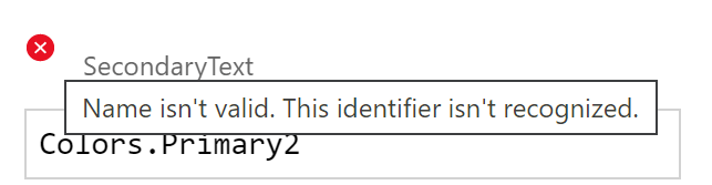
Note that these default values we are specifying are referencing names of Global variables that we've set in our Application.OnStart. We've created a table variable of color records for use in our application. Also note, that when editing the Component these color values are not applied and the parameters will display little red error notations. This is because the component has no awareness of the application. The key to this strategy is to provide your branded color palette to all of your Power Apps developers, or you create a branded application starter template that everyone starts from. Then everyone gets the same Global color variables and when they import the component and use it in their application, the default values match actual Global color variables defined in the application.
If you can get past that little annoyance, you'll find that it saves you a bunch of time. Now go check the other application screens when you've applied the header component... viola!
In addition to color properties, we could leverage the same technique to set the application name text, secondary text, etc. The possibilities are only limited by the complexity of your component!
That said, what makes this little gem super valuable is that as a component, not only can it be reused across your application, but you can publish this to be imported by others in your organization for their applications. Or better yet, you can publish it to an organizational component library.
.jpg)