Power Apps Navigation Building Blocks

If you want to drive your power apps user experience and adoption rates through the roof, implementing navigation best practices and reusable components is a great way to do that.
Overview
To start off, we’ll define navigation in this article as “clicking something to reveal something else”. For example, clicking an ellipsis to access a drop-down menu where you can click something that will reveal another thing. We’ll be using Power Apps Studio as our guide for discussing navigation objects and the purpose they generally serve to help make your app easier to access and use.
Header
The first thing to break down is the header. Most, if not all apps will more than likely benefit from a header. You’ll see this at the top of the all the screens in our app, so you’ll want to put all the items you want access to wherever you are in the app up in the header.

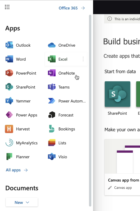
In the upper left corner of the header, we’ll find what Microsoft calls the App Launcher (some call it the waffle). Clicking it opens a side bar that allows access to all the other apps within the Microsoft 365 Suite. Most of your Power Apps won’t need this, but it’s a good option to have if you ever have an app that is a series of other apps and want to provide links to those other apps.
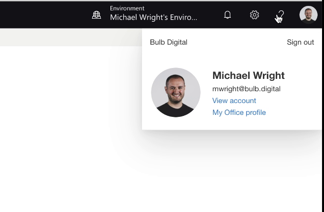
On the right-hand side of the header we have things that are universal in the Power Apps Studio for any screen you may be on. This is especially helpful for tabs that would include things like environments, notifications, settings, help, and profile. You should notice that a lot of these are just side overlays on the original screen.
Left Menu
Next, let’s look at the left menu. Starting off you’ll see a small icon with three horizontal bars, often referred to as the “hamburger”. This is very common and something you should try because of its importance to screen navigation. All our screens that we want users to directly go to from anywhere in the app should be listed here. In Power Apps, this icon can actually be adjusted so that when you click it for a second time the panel shrinks, and the screen moves with it.

Within the left menu we can also have nested items, which makes them easy to access, but keeps the appearance of the nav from getting too busy. In our next blog we’ll include a resource for how to build this component.
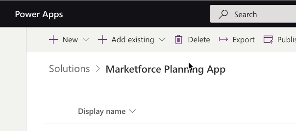
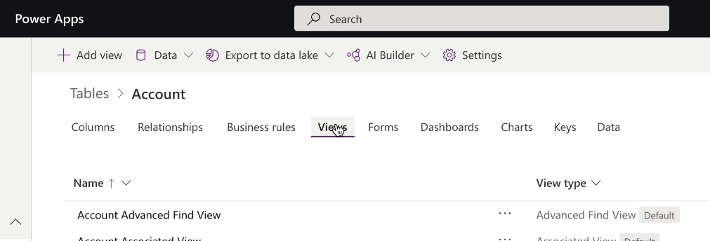
Subnav
Now let’s look directly below the header to the subnav. The commands listed here are contextual settings or actions for what it is you see on the screen. While the placement, look, and feel is similar everywhere in the app, they are unique to what you see on each specific screen. If you were to click something underneath within the screen, you’ll notice the subnav’s options change.

This subnav looks great and helps save room. If you want to add even more in the subnav, you could add drop-down menus without using more room. This is another thing you can do in Power Apps and is a great way of consolidating all of the options you could click on within the subnav.

Breadcrumbs
Right below the subnav you’ll find what’s called Breadcrumbs. This is incredibly handy because as you get deeper and deeper into the app, there’s a trail so you can find yourself back to the original screen.
Tabs
Tabs are great because instead of navigating to a bunch of different screens, you can take similar content and group it under the subnav and that way you don’t need to continue scrolling. So, when you click through it, the content under the tab is being replaced and the options in the sub nav change as well.
Recap
If you are ever in doubt of how to go about navigation, think about the apps you use a lot, and the Microsoft 365 World in particular. They do a really great job throughout all of their apps of making the look and feel of different components similar. If you can strive in your Power Apps to do the same and make it consistent visually and functionally, the user experience will be so much more pleasant and intuitive.
There are a lot of examples of navigation building blocks and object types on the Power Apps Studio website. So, if you can use that site as a guide and understand the different purposes of the elements described in this article, you’ll be on your way to an app that has a great navigation experience.

SELF ASSESSMENT
Is your business getting full value from your M365 subscription?
Billions of dollars are wasted each year on underused subscriptions. Take 3 minutes to find out where your tools are driving results, and where they’re holding you back.
Find Out Now
Is Team Communication Holding You Back?
Find Out in Just 2 Minutes.
Take our quick scorecard to uncover communication gaps and hidden barriers within your team.
.jpg)