


Customizing SharePoint Forms With Power Apps

If you’re using modern UI in your SharePoint list libraries, you might find that the forms, data capture, and data entry aren’t what you need for your end-users. To fix this, you can use Power Apps to enhance data capture.
Intro
SharePoint has come a long way when it comes to managing metadata for lists and libraries. Before we would have had to use InfoPath or customized ASPX forms using SharePoint Designer, but now with modern UI in SharePoint Online we can achieve a better user experience, and you can take it even farther by using Power Apps.
Creating a Custom Form
To start, let’s look at a customized SharePoint list to show what it’s like to create a custom form from a list.
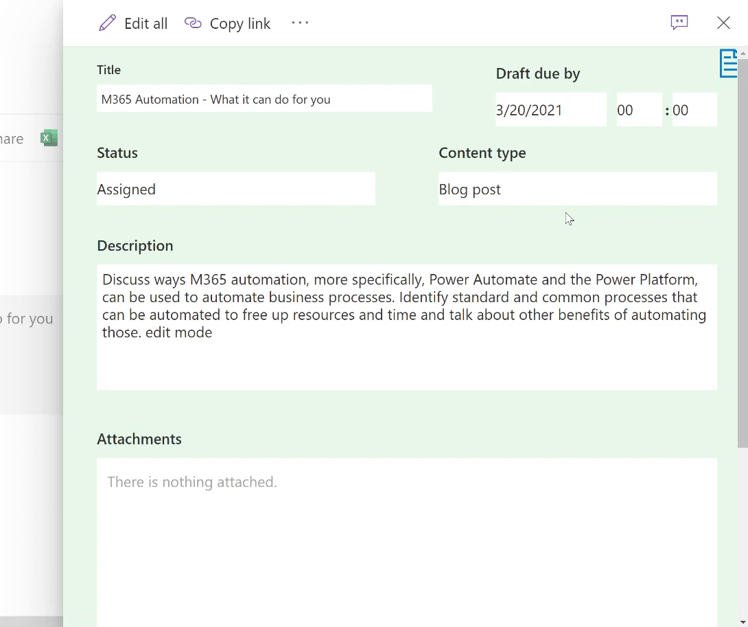
Here you’ll see some demo data and a content scheduler list that has some added customizations.
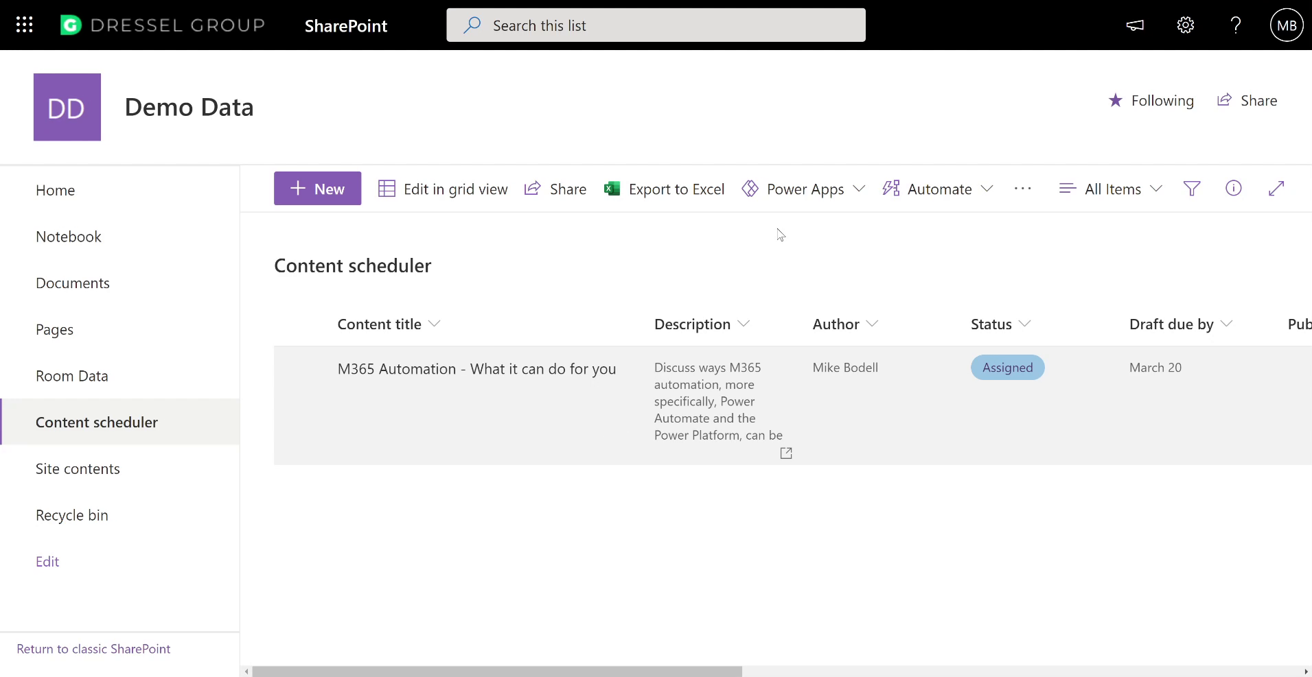
Let’s add a new form – you'll see the default info panel available for SharePoint lists that allows you to enter data for the form. This panel works well out of the box, but there are some specific situations where you may want to make it better. We’ll show you how.
Click on the `Integrate` menu on the list, hover over `Power Apps` and click `Customize Forms`.

This will load up a default version the form in Power Apps for you to customize to suit your needs.
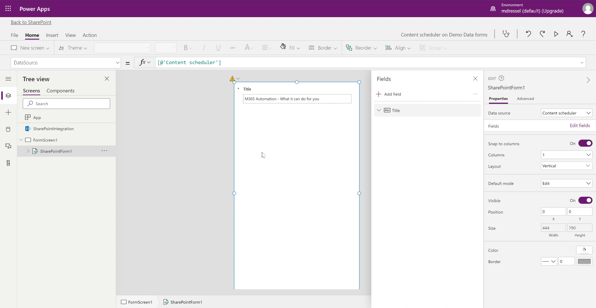
In our case, we want to adjust the form size away from the default Mobile View. To do this, click the `File` tab and then the `Settings` menu. Then go to the `Screen Size + Orientation` settings.
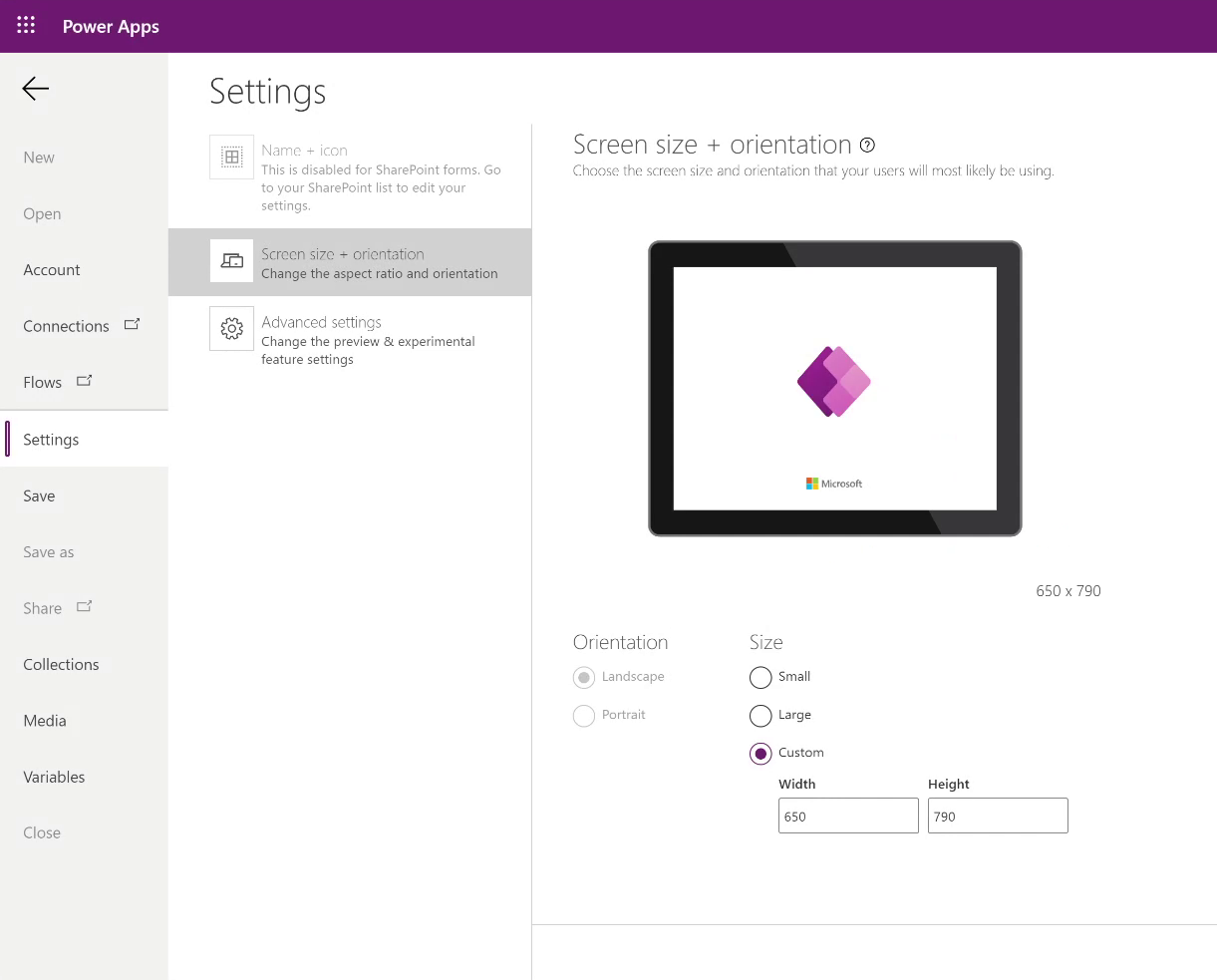
You will then have the option to set orientation and size. In this case, we want the size to be custom, since we want it to be a bit wider than it already is, we’ll go with `650`. Once we have our custom width, hit `Apply`.
Note: When you apply those settings and already have laid out content on your form just how you like, whenever you come back and change the screen size, it will rearrange all that content back to square one. So, our suggestion would be to minimize the number of times you need to do that.
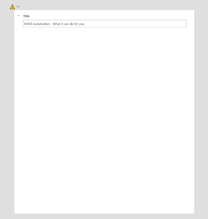
Going back to our form, you’ll see it’s now bigger than what we had before, and we can expand it to fit the screen.
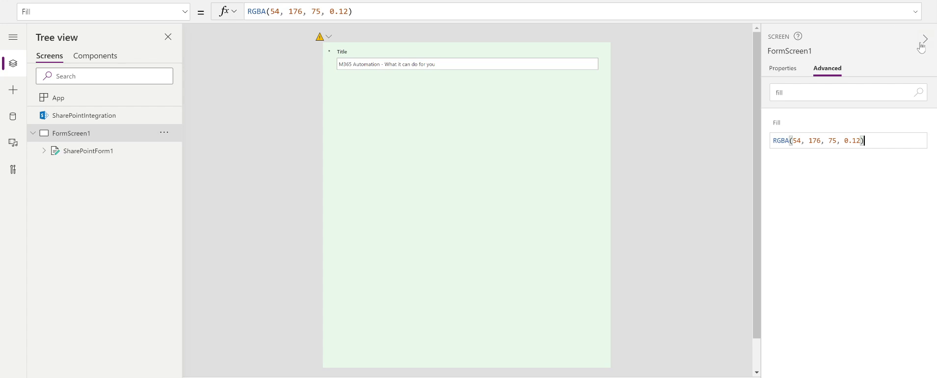
The next thing we want to do is add a bit of color for the end user. In our case, we want to use a color with some transparency to it, so navigate to the `Advanced` properties panel for our `FormScreen1`. In the search bar, search for `Fill` and it will filter all the displayed properties and only show the `Fill` setting. We’re going to go with a pale green color, so enter `RGBA(54, 176, 75, 0.12)` into the text box.
Adding Fields
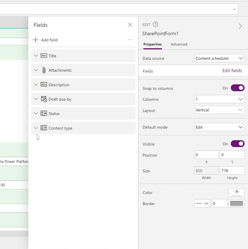
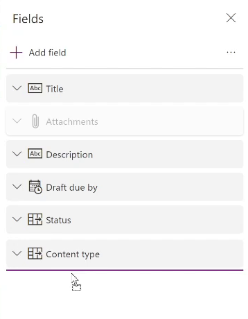
To add the other columns or fields, select the form and click `Edit fields` in the properties menu. That will open another panel, where you can click `+ Add field`. The fields we’re going to add are: Attachments, Description, Due Date, Status, and Content Type.
Once you add those, they will be arranged in whatever order they were selected. However, if you wanted to change the order, you can just drag and drop them into the positions you want them in.
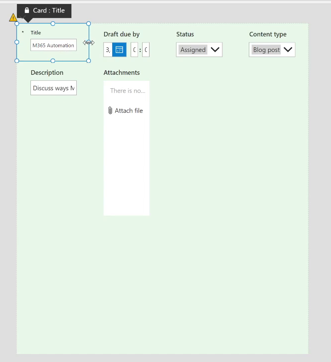
For example, we want Attachments to be displayed at the bottom, so we want to drag it down below the other fields.
Adjusting the Layout
Another thing that would be beneficial to look at is the layout to make sure it flows well for the user. In the Form Properties panel, we can choose the number of columns we want to give ourselves flexibility in the layout. Then we can set various fields to take up one or more columns.
In the example, we’ll add twelve, and as you can see it shrinks everything down.
From there you can adjust the width and height of the fields if you want them to take up a certain amount of space on the form.
Now, let’s look at the description. This is where we can expect the user to input the most amount of information, so we want to give them more than just a line of space. In your properties, set it to a multi-line field and drag the height to make it larger. Lastly, drag the attachments to have this field take up the rest of the form.

Adding an Additional Screen
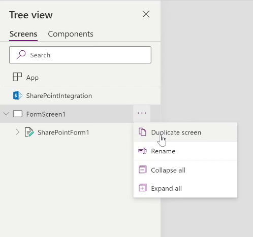
Let’s say in addition to the fields on the form we also would like to add more content, whether that’s an article or blog post content, in which case we will add an additional screen. To do this, go to `Form Screen 1` on the left and select `Duplicate Screen`.
Now that we have what is basically a copy of our form before our adjustments, we need to rename it to fit what we will use it for, calling it `ContentScreen` and `SharePointForm2`. This rearranged all the fields on our form on this screen, but it’s no matter because we’re going to remove the fields anyways. To do this, select ‘SharePointForm2’ then ‘Edit Fields’ and remove all the fields.
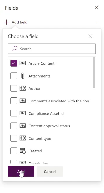
Now that we have a blank slate, we will go in to add our `Article Content` field. Going back into Fields, you check the box `Article Content` and click `Add`.
In this case, we know this will be a rich text field, so we’ll pay attention to the control type. There are a variety of options, and you will want to select `Edit Rich Text`.
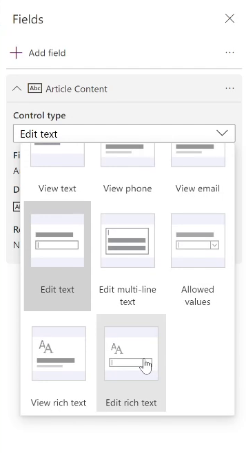
Now you’ll have a much nicer control for blog posts or article content. Resize it to fit the screen, and now users can enter content, make it bold, add hyperlinks, etc.
SELF ASSESSMENT
Is your business getting full value from your M365 subscription?
Billions of dollars are wasted each year on underused subscriptions. Take 3 minutes to find out where your tools are driving results, and where they’re holding you back.
Find Out Now

Is Team Communication Holding You Back?
Find Out in Just 2 Minutes.
Take our quick scorecard to uncover communication gaps and hidden barriers within your team.
Adding Navigation
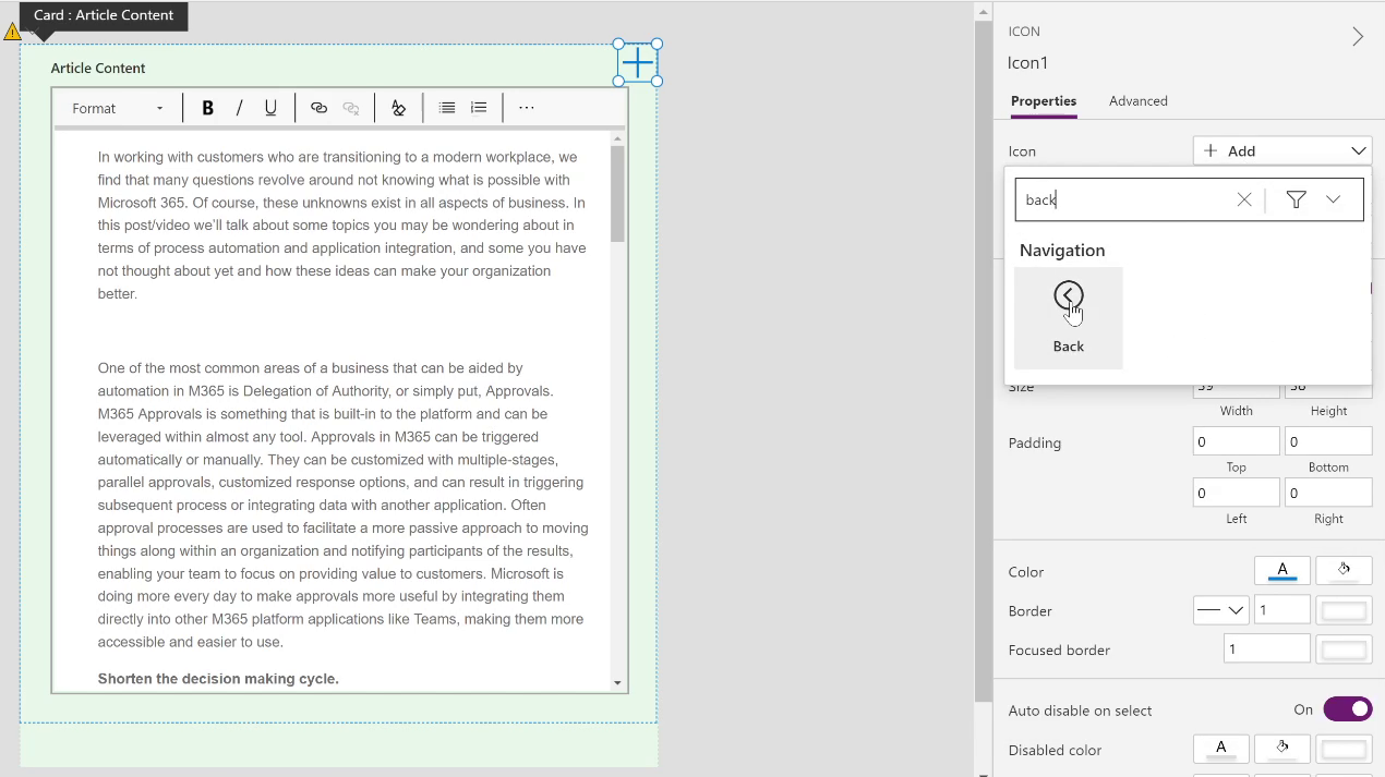
Now that we have added this new screen, we need to think about how the user will get to it. To help with that we’re going to add a button to the screen. Open the `Insert Panel` on the left and click the ‘Add icon’ option. This will drop a “plus” icon on the top left of the screen. Drag it to the top right and resize it to be smaller. By default it’s using the “add” icon and we’re going to change that to be a “back” icon, which you’ll find in the `Properties Panel -> Icon Setting`.
Next, we will need to wire the button up. First, select the icon, and by default the `OnSelect` method will be selected in the top bar, and we can type in our code for the navigation in that field `Navigate([@FormScreen1]);`.

Then if you put it into run mode and click that icon, it will take you back to that original screen.
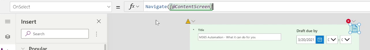
So now we want to be able to do the same thing, but this time we will be able to navigate to the content screen from `FormScreen1`. To do this we’re going to add another icon. So again, select your form, click ‘add icon’, place it in the upper right-hand corner, and this time, in the properties, search for ‘document with content’. This will be the indicator that if the user wants to enter content, they can click that icon. Lastly, update the OnSelect to navigate to the Content Screen with `Navigate([@ContentScreen]);`.
Adding Validation
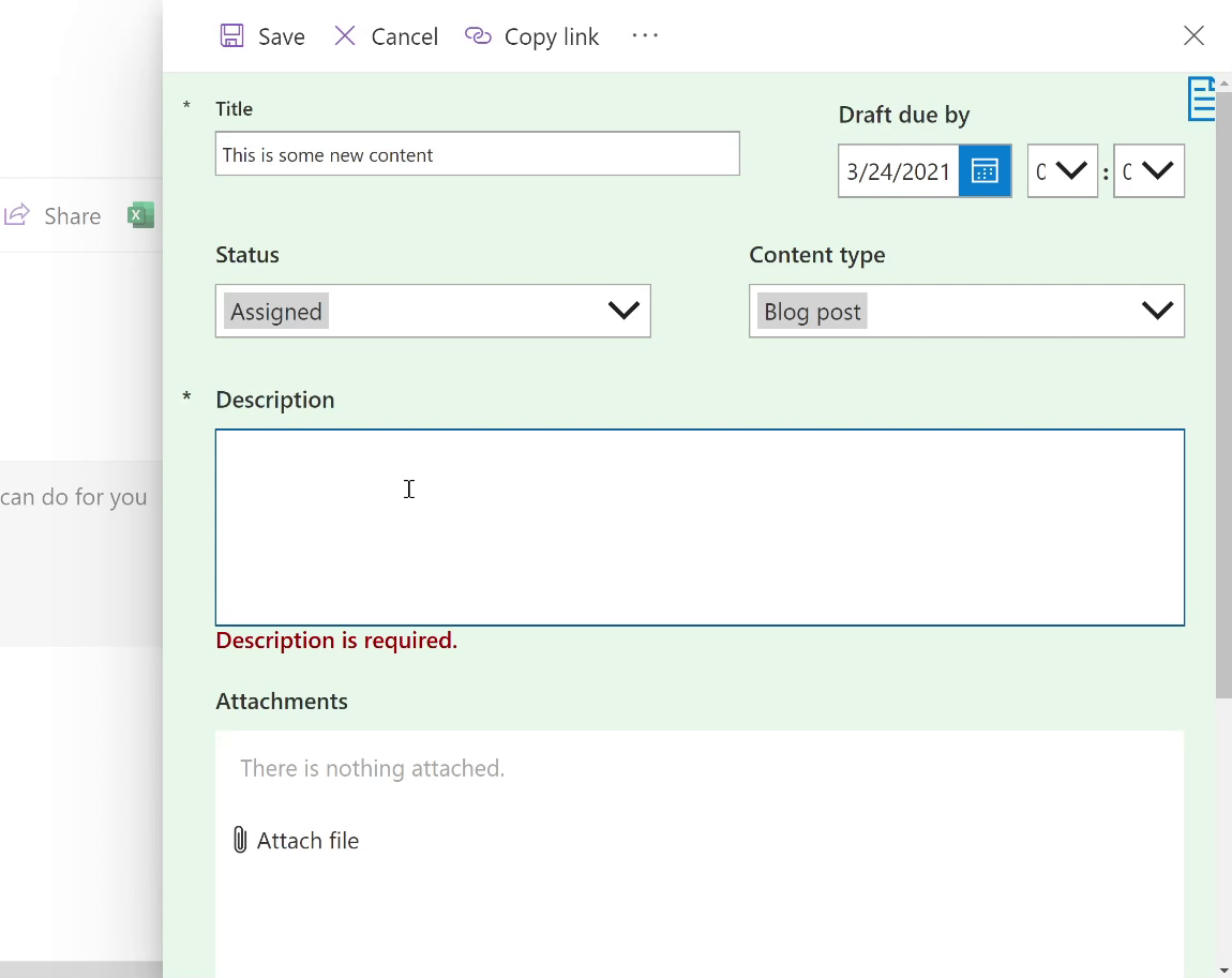
Another scenario you might come across with your form is you have special cases with your content where you need to implement some validation. For instance, if the content has been scheduled and assigned you may want to require a description to be entered.
To do that, we’ll focus on the description field and adjust it to be a required field. As you are setting it to `required` in your insert settings, you’ll notice that the field is set to false, which we want to toggle based on what is set on the status field. To do that we will first have to unlock the data card in our advanced settings, which you can find on the right of your screen.
Next, we’ll need to find the name of the control in the Tree View on the left side of the screen. In our case it is set to `DataCard4`. Now we can go back to our description data card, we can set the `Required` property to `If(DataCardValue4.Selected.Value = “Assigned”, true, false)`.
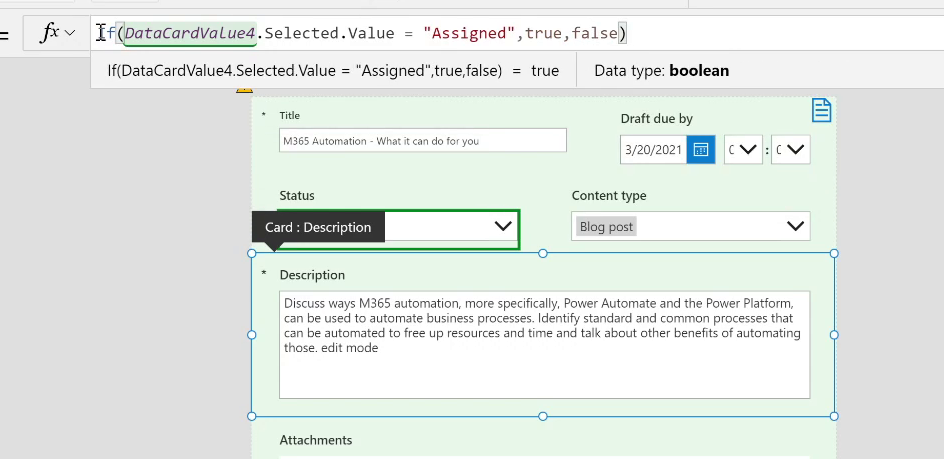
This makes it required whenever the status is “Assigned”. You’ll see a little star next to the description to indicate this, but if you take yourself back to run mode, you can change it back to “Planned” and it’s no longer required.
Form Control During Events
Now we need pay attention to the way these forms behave when the user enters certain states like new, edit, or when the form is being saved.
Let’s start by going over to the tree view on the left-hand side and notice something called SharePoint Integration. This is the thing that connects the form to our SharePoint data, managing the validation and saving of the content for you. There will be different events to manage which are `OnCancel`, `OnEdit`, `OnNew`, `OnSave`, and `OnView`.

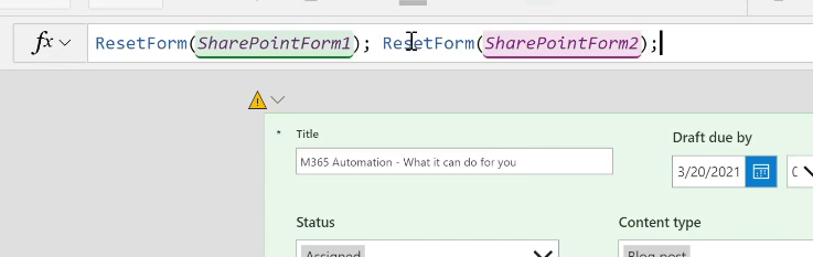
First let’s look at the `OnCancel` setting. Currently, it’s resetting `SharePoint Form 1`. Because we created multiple screens to this form, we want to make sure that when the user chooses to cancel, we also want to reset `SharePoint Form 2`. To do this enter `ResetForm(SharePointForm2)` into the function box.
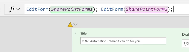
From there we will move on to the `OnEdit` event where we will make the same change, duplicating the existing code but targeting `SharePoint Form 2`, so when we enter edit mode for the form, both screens/forms enter that state.
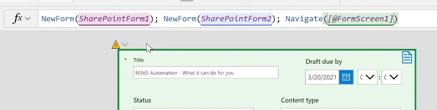
Next, what happens when the user clicks “New” in SharePoint? We want to make sure that:
- We’re setting the form to the “New” state
- They start on the first form rather than the Content Form
So following suit like the other settings, make sure to call the `NewForm` function with the second form, but also add navigation to the main screen.
`NewForm(SharePointForm1); NewForm(SharePointForm2); Navigate([@FormScreen1]);`
Then we want to make sure that the forms will be saved once submitted, so add that into the function box in the `OnSave` event.

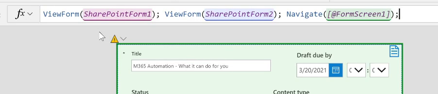
Lastly, set the `OnView` setting. Make sure to navigate the user to the main form instead of the content form.
Deploying and Testing the Form
Once all those events have their controls and navigation properly set up, we can move on to deploying to see how it works for the end user.
To do that head to the `File` menu and click `Save`. It will then prompt you with the option to publish to SharePoint. Once you click publish, all your users who have access to the SharePoint list can use the new form.
Then click over to your list, choose to create and edit a new one, and you will see the form you just created complete with the new layout. Go ahead and try it out!
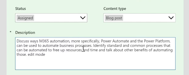
If you have a new piece of content that needs to be scheduled. You can now use your new form to fill out what date the draft is due, what the content type is (blog, video, social post), and the status of the content. Even more valuable is that if you only fill out these fields and go to save the form, it stops you because the description is blank. This can be helpful when fields need to be filled in to provide additional context like with our description field.
Conclusion
If you’ve been trying to move away from InfoPath or create custom forms in SharePoint Lists, using Power Apps to enhance data capture can help you provide your end users with what they need!

.jpg)


