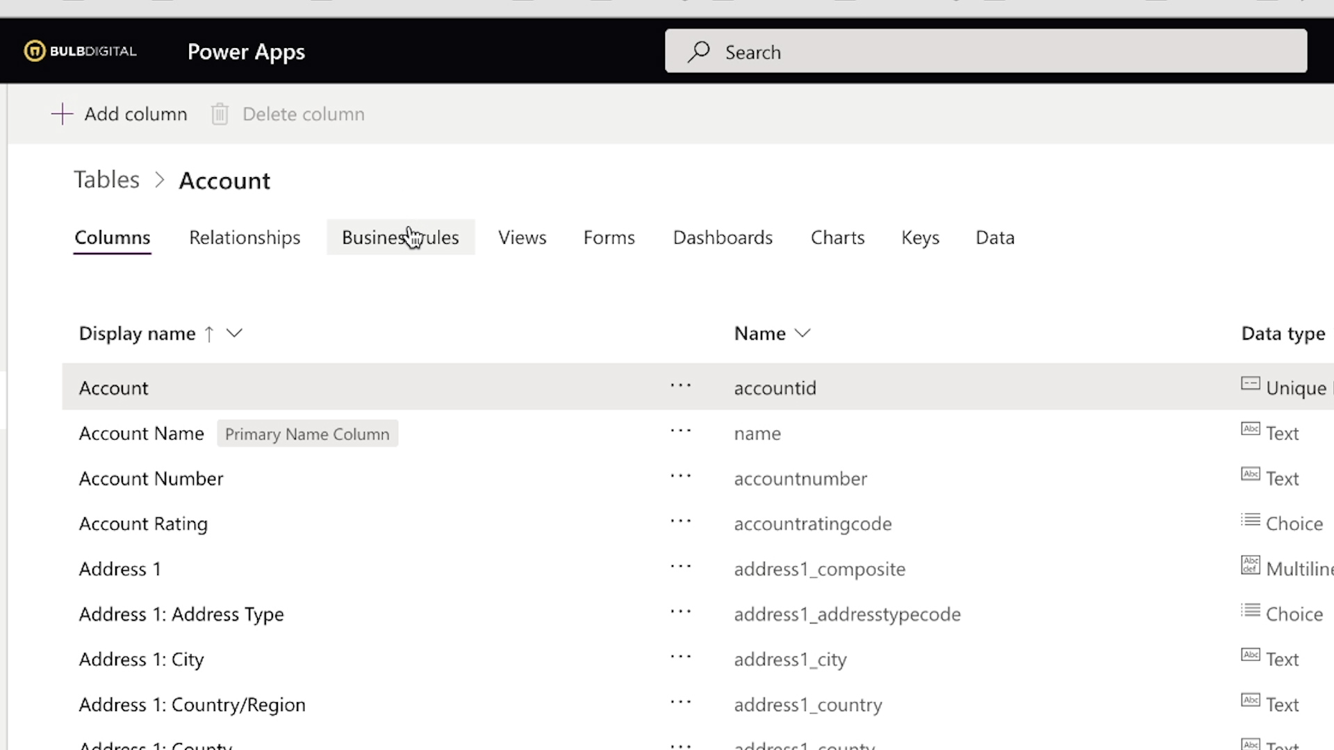
7 Power Apps Navigation Best Practices

Now that you have your building blocks, let’s look at best practices for building your Power Apps.
Intro
This article will be the final in a two-part series about navigating Power Apps. In case you haven't read the first blog, Power Apps Building Blocks, we discussed object types regarding the Power Apps studio. Now, we will take those concepts and talk about best practices that result from them and how you can implement them in your Power Apps.
1. Use The Right Tool for What You Need
One question to ask yourself when thinking of navigation and Power Apps is, ‘What is this object designed for?’. If you need to navigate somewhere consistently from any screen in your app, put it in the header. If you need a place to show your screens, put them in the left nav. Need a place to put settings unique to that page or navigations to that page? Put them up in the sub nav. If you have a little drop-down of navigations specific to an item, put them in an ellipsis drop-down. Answering that one simple question can help to make your app so much easier to use.
2. Be Consistent with Looks, Function, and Placement
Within your app and across your apps it’s important to make sure you’re consistent with your looks, function, and placement. As an example, Microsoft 365 has its apps designed so that you can jump from one app to another and intuitively know how to use them. This is because they do things similarly across all their apps and they make sense. So, if you can extend that into your own Power Apps the users will have an easier time navigating your app because the experience will feel familiar.
3. Only Show What You Need
It’s very important that you take advantage of grouping and hiding things within your app. If you show your users too much all at once, then they can become overwhelmed. However, you also don’t want to fall too far to the other side and show too little. The user might become frustrated if they must continuously click something over and over to reveal what they should have been able to find in one or two clicks. If you’re having a hard time coming up with logical groups for things, then you can look at the Power Apps Studio. They do a great job of finding that happy medium of logically grouping their items.
4. Collapse Things for More Screen Space
When creating your Power App, it can become easy to clutter your screen space. To fix this issue and make sure your app looks good and functional use collapsible screens. It will not only save you space but give you a space to store some of your components within your app.
5. Use Screen Overlays Instead of Navigation Pages
Another feature to take advantage of is screen overlays. A screen overlay in this example is what I refer to as the screen that appears when you click an object in the subheader. In our first blog of the series, Power Apps Navigation Building Blocks, this is where you would find the breadcrumbs.
Using a screen overlay will be much handier because it allows the user to find what they are looking for and not have to click on a bunch of different screens. Also, they don’t have to worry about trying to find their way back if they lose their place.
6. Use Hover Styles for Selectable Objects
This next tip is very important because, without it, it can potentially drive the user mad, and that’s making sure you have selectable objects obvious. Nothing can be more frustrating than hovering to click on a navigation item and it's not accessible. There must be some sort of visual indicator and you can do this by turning the cursor into that little pointing hand you see often on other apps and websites.
7. Use Components for Common Objects
As mentioned before, you want the look and feel of your app to be consistent and functional. That’s why you want to use Power Apps Components as much as you can for things that are going to be the same throughout your app. Specifically, use components for the header, left nav, and waffle menu if you have one. The good news is you only have to create them once and place them on every screen after which will save you time.
Conclusion
Understanding object types in Power Apps is very important, but even more, is knowing how these object types can be used to create a great navigation experience for the user. Hopefully, this blog as well as the first in this series Power Apps Navigation Building Blocks has been able to take these concepts and marry them so you can start implementing them into your apps.
SELF ASSESSMENT
Is your business getting full value from your M365 subscription?
Billions of dollars are wasted each year on underused subscriptions. Take 3 minutes to find out where your tools are driving results, and where they’re holding you back.
Find Out Now
Is Team Communication Holding You Back?
Find Out in Just 2 Minutes.
Take our quick scorecard to uncover communication gaps and hidden barriers within your team.
.jpg)