


The Power of Using Color Psychology for Your Users

If you're looking to select the right colors to convey your brand, using basic color theory can help you choose colors that communicate effectively and provide a positive experience for your users.
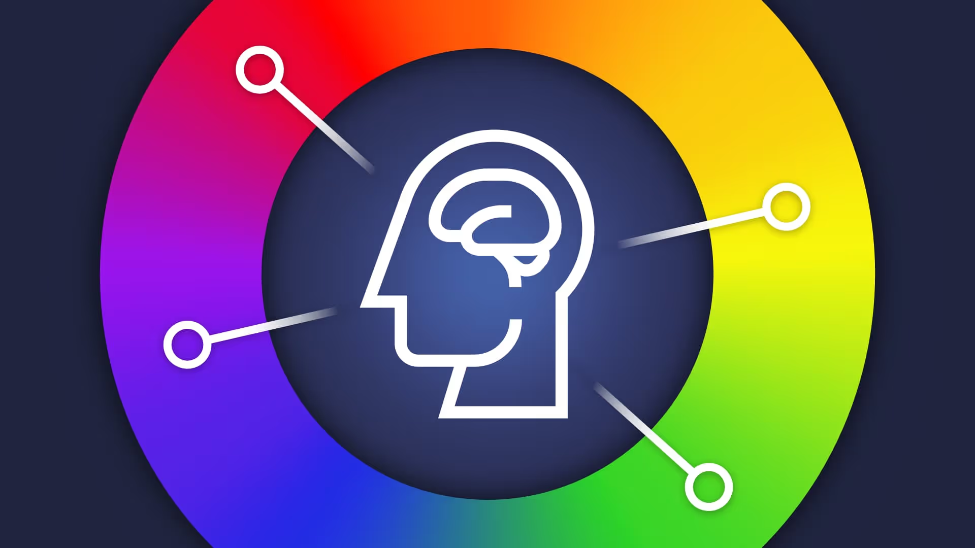
All About Color
Color may seem arbitrary, or something you can select as an afterthought, but effective organizations use colors intentionally to solve their needs. Selecting good colors is more than picking your favorite color. Good color communicates effectively and leaves people with a good impression, but bad colors can make people’s lives harder or make people turn away before ever giving you, your content, or your organization a chance to make your case.
Why We Use Color
You don’t need to be a designer or an artist to appreciate beauty in the color around you. Color makes the world more interesting, vibrant, and appealing. One of the first things we learn as children are the names of colors and the colors of everyday objects. Grass is green, sky is blue, and a fire truck is red. It seems so second nature to us, and that is because to an extent, it is. Strangely enough, our perception of color is tied to our needs as hunter-gatherers, and the language we’ve created to discuss and categorize colors. Societies with more words for color are actually able to see more colors.
Each society categorized and defined colors in a nearly identical order, even if they never contacted one another for thousands of years because some colors are more important to life and survival than others. This means that some colors have psychological effects on us that date back thousands of years, so deeply ingrained in our minds that we could not overcome them if we tried. Keep in mind, however, that the meaning we attribute to colors varies between different cultures, so don’t assume that every audience will have the same reaction to every color. In this article we'll be discussing color from a western perspective.

Red
Almost every culture in the history of mankind first created a word for the color red. Red is a color we associate with our most primal instincts and is the most essential color for survival. The easiest association one can make to the color red is blood. Every time our ancestors saw red, our brains were given essential information directly related to our survival. Imagine you're walking through the woods and at your feet you notice a splotch of red. Immediately, your heart rate rises, your pupils dilate, and you look around for threats. “THIS IS NOT NORMAL.”
This red could mean a variety of things, but you know that something has happened and you need to consider that information. Is there a predator nearby who just made a kill? Are you next on the menu? Is this from a wounded friend who needs help? Are YOU wounded? Are you tracking the prey you just shot so you can feed your family? No matter the circumstances, red is an indicator that something is happening, and it needs to be addressed immediately.
We have come a long way from our hunter gatherer ancestors, and our daily concerns are less about predators and tracking our kill to avoid starvation. However, the way red strikes our brain has persisted throughout time. This can be used to our advantage. Companies who employ red as a brand strategy are trying to get that primal reaction out of you. It is often used for restaurants or companies who benefit from you having a craving you want to resolve. It's used for companies who specialize in romance or love, for more carnal human desires. It's also used to indicate something important that stands out in the crowd. If you’re sick or injured and need to get to a hospital, there is only one place on the entire campus using red. Follow that red marking, and you will find your way to the emergency room.
In our digital designs, we need to be careful where and how we use red. Red indicates things like errors, or problems. It tells a user, “Something is wrong, this is not normal.” Even for companies who use red for their branding, care should be taken to effectively use red so as not to overwhelm users. Red usually means, “There is a problem, and I must solve it.”

Green
Green often means the exact opposite of red. Most of the time, green is a color which calms us. In the metaphor of a walk in the woods, we are surrounded by green. Green is normal. Green is good. If we are walking casually, we can take in that green and appreciate it as a calm, uneventful walk. Oftentimes if we live in a city, we long for the feeling green brings. It means nature, it means health, it means something is going right.
If we are not surrounded by green, even a little bit usually tells us something good. A tiny bit of green in your flowerbed means your plants are doing fine. The green light in the city tells you that you may proceed. The green thumbs up when you are interacting with something online tells you that you did something good.
Psychologically, the contrast between green and red is pretty self-explanatory. If red means there is a problem, green means things are going well. In digital designs, use green to indicate success or progress. It is important, however, to be careful not to rely exclusively on red and green when indicating success or failure. Red-green color-blindness is the most common type of color-blindness. A color-blind user is not going to understand what your green alert means when both red and green appear brownish grey to them. Use verbiage or iconography as a redundancy for such users.

Blue
Blue is a relatively new color in the scheme of human development. As one of the rarest colors in nature, it is one of the last to have been named. Reading ancient tales such as Homer’s Odyssey and Iliad, we hear the sea described as wine-dark and the sky described as bronze, but clearly seeing color is not a new human trait. It turns out that ancient languages didn’t have a word for it, so blue was not really a concept until recently on a cosmic scale.
As such, blue is a color often used for things which are new or of the future. Blue is a color that is often associated with tech, and is a color which is calming and inoffensive. It may not subconsciously trigger cravings like red, but it establishes trust. If someone is asking you to trust them with sensitive information or make you feel secure, there’s a solid chance their brand and site will rely on blue (regardless of whether or not you should trust them with that information)
In user interfaces, blue is a great way to make something stand out from its surroundings without associating any real urgency or meaning aside from, “Look at me, I’m different.” The default color for hyperlinks in any browser is blue, because in a sea of white and black, blue stands out. Use blue to signal bonus information, to indicate click-ability, or to establish trust with your users.

Yellow and Orange
Yellow is a bright attention-grabbing color, but does not quite carry the same psychological weight as red. Orange has similar implications as yellow in interfaces, but is used slightly differently in branding and graphic design. Brands which use yellow are brands which want to convey a sense of energy. Yellow is also a color often associated with warmth and happiness, a trait which it shares with orange. While orange may evoke feelings of warmth and summer and energy, that energy can also be a bit aggressive and intense. If the energy you want to convey is not aggressive, lean into yellow.
In interfaces, yellow is a good way to convey caution, without stopping a user in their tracks. Yellow is great for warnings or to tell a user to pay attention without giving them an error which may stop them entirely. Yellow is also a color which one needs to use selectively and carefully, as it often does not provide sufficient contrast for accessibility purposes for things like text or icons on light backgrounds. There are strategies one can employ to make yellow accessible, but it will require a little more complexity and consideration than other colors might. This is why some organizations may use orange in place of yellow.
Color Theory 101
We don’t always use color exclusively to give a status update or indicate success. Colors are also selected as a part of a brand identity, and can provide individuality and help us stand out to our users. Using red for a brand color doesn’t necessarily mean that your business is an emergency center or restaurant, and using green doesn’t necessarily mean you deal in garden supplies or money. While we should keep these associations in mind, the rules aren’t set in stone for branding purposes.
When we have one determined brand color, selecting harmonious color combinations can seem daunting, but there are a few types of color relationships we can rely on to put us on the right path. The easiest way to select these is by looking at a color wheel.

Complementary Colors
Complementary colors are colors directly across from one another on the color wheel. Red and green are complements. Blue and orange are also complements, as well as yellow and purple. Using complementary colors will ensure that there is contrast in your designs.

Analogous Colors
Analogous colors are colors which sit next to one another on the color wheel. There is less contrast between these colors but often works to create harmony. Red, orange, and yellow are analogous colors, and some more are shown below.

Split Complementary
Split complementary colors take two colors which are analogous, and adds their complements into the mix. Red and orange are analogous, so by using green and blue as well, we create a color scheme which has opportunities for harmony as well as contrast.

Brightness and Saturation
Color is not only defined by its hue (where the color lands on the color wheel) it is also defined by its brightness and saturation. Colors with the same hue can have different feelings and meanings when you change up their brightness or their saturation.
Brightness
Brightness is pretty simple. How light or dark is your color? You can compare a color’s brightness to a grey scale. On a scale of 0-100, black is 0 and white is 100. Most colors naturally lean towards a level of brightness. Purple is almost always darker than yellow for example, but even among a single color, brightness can vary. Managing brightness is important when choosing colors, because contrast (a relationship between light and dark) is important for clarity.

Saturation
Saturation is how intense a color is. If you're mixing paint, saturation would be how many drops of color you need to achieve your result. If you put a single drop of red into a bucket of white, you will have some pale pink paint, but if you use mostly red paint, that red will be intense. Desaturated colors are less imposing, intense, and energetic than saturated colors are. In this way, you could make a nice calming red and or an intense and exciting green, which might otherwise seem counterintuitive. Saturated colors can be tiring to look at for too long, so try to avoid turning everything up to 100.


SELF ASSESSMENT
Is your business getting full value from your M365 subscription?
Billions of dollars are wasted each year on underused subscriptions. Take 3 minutes to find out where your tools are driving results, and where they’re holding you back.
Find Out Now
Is Team Communication Holding You Back?
Find Out in Just 2 Minutes.
Take our quick scorecard to uncover communication gaps and hidden barriers within your team.
Using Color Effectively
Now that we have a basic understanding of how colors impact our psyche and harmonize with one another, we can use this knowledge to create better digital experiences. Brand colors may impact our decision making when selecting colors, but for interfaces and dashboards and any experience which requires information to be displayed clearly, we can pretty easily rely on psychology to help us make decisions.
One of the most important things we must do when using color is use it sparingly. If everything is bright and colorful, each instance of color becomes less meaningful. It’s a good idea to rely on neutrals, such as white, grey, or black to do most of the heavy lifting in our designs. Providing a high contrast base such as white or light grey with a dark text color such as black, charcoal, or navy will make our content easy to read.

We use our brand’s colors to bring a bit of life to our interactive elements and to give the interface personality. Then finally, using other colors consciously will clearly convey important messages to our users. A good rule of thumb is to follow the 60-30-10 rule of color. This means that 60% of the screen is covered by a main neutral, often white. 30% of the screen will use a secondary neutral. Then, 10% of our designs will use branded colors.

Other colors are then only needed when we want to communicate a specific message so as not to overwhelm users. This is just a guideline, which can be adapted to individual needs, but following it helps to ensure that our color has something to say each time we use it.
Choosing colors can seem daunting, but as we’ve laid out here, it doesn’t have to be. Using harmonious or contrasting color schemes to add our brand to our designs is much easier when you follow basic color theory. When we need to send a message to users quickly and clearly, we can rely on our instinctual psychological responses to color, to make dashboards, alerts, and progress bars which help users understand what is happening quickly. Using color makes our digital experiences easier to understand and more delightful, which helps our users accomplish their goals and helps us to make others successful.

.jpg)