


Transform Your Power Apps: A Beginner's Guide to Containers

If you're building Power Apps and feeling a bit overwhelmed by containers, don't worry, you're not alone. Many developers find containers to be a bit tricky at first, but once you understand the basics and the purpose behind them, it can make a huge difference in creating an organized and efficient design experience.
Resisting containers
Honestly, when I first began making canvas Power Apps, I fought against using containers because I felt restricted. I found myself frustrated by the clipping that occurred when my objects were too large or placed beyond the edges of the container. My workaround was to place all objects at the top level directly on the screen and to reference other objects in each X and Y property.
I was winning my battle to outsmart them until I had to reassign coordinates to each object after deleting a single text label. Containers could be avoided, but at what cost? I surrendered and devoted time to understanding my enemy and its strengths; once I realized the utility of containers, I was able to save myself time and headache while designing.
What are containers? Why should they be used?
Containers define sections of the screen to facilitate a more organized design experience. They can be used to prevent overlapping elements, to create depth, to quickly align/justify content, and to create responsive designs.
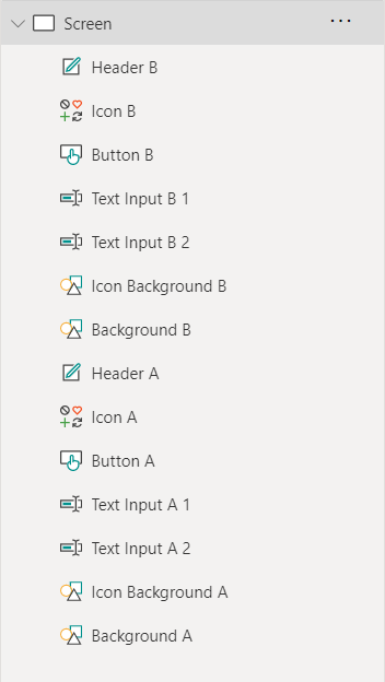
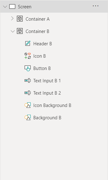
Containers organize and declutter the Tree View sidebar into collapsible sections of objects, and when given a background color, they can even be used to create depth and to hide or display different content.
Types of Containers
- Default Containers – The most straightforward type of container is the default container, simply titled “Container” on the Insert menu. This tool allows for overlapping objects and offers a more freeform design method.
- Directional Containers – There are two types of directional containers: horizontal and vertical. These types of containers don’t allow for overlapping content because they automatically organize their objects next to each other. These are useful to allow for responsive app design and to make the design process more efficient.
Properties of Directional Containers
My initial frustration with these tools mostly came from not understanding a lot of the properties of directional containers. So, I created some visuals to help me to grasp the concepts. Now I can share them with you! 😀
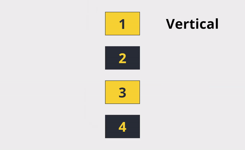
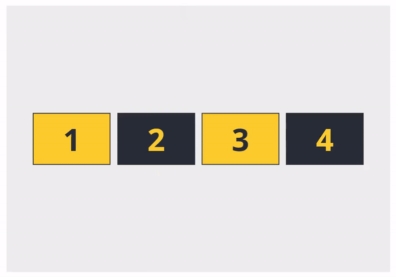
- Direction defines the direction the contents will stack. Vertical containers organize objects from top to bottom, while horizontal containers place objects from left to right.
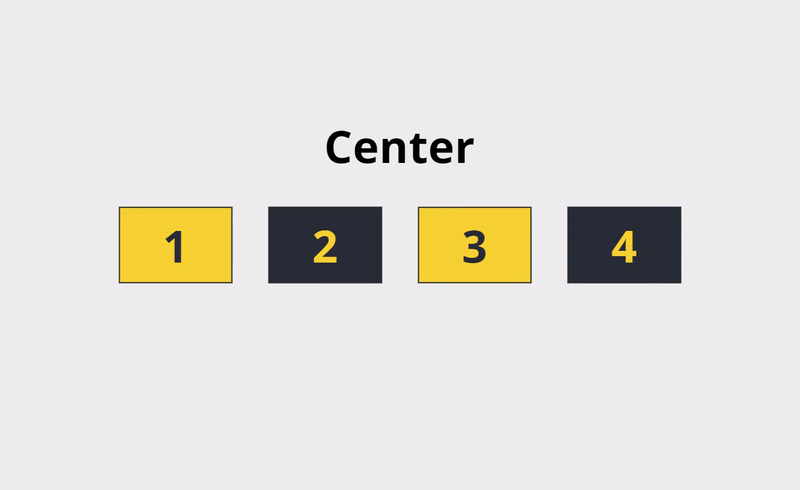
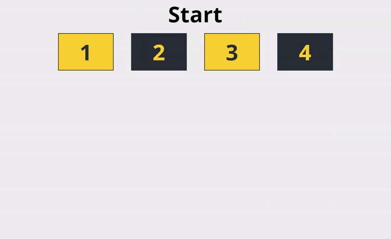
- Justification is similar to justification on a Word page; objects can be justified to the start or end of the container, grouped in the center, or span the entirety of the container. The justification corresponds with the direction of the container.
- Alignment describes the way objects are positioned in the container, like justification, but in the opposite axis of the container’s direction.
In vertical containers, the alignment positions objects on the horizontal axis, while horizontal containers do the same but on the vertical axis.
- Gap defines the size of the space between objects in the container. A gap of `0` places objects directly next to each other, while a gap of `5` will space objects 5 pixels apart.
- Overflow defines what a container will do when its contents exceed its size; this can be set for both axes: horizontal and vertical. The two options are to “Hide” the content or to “Scroll.”
“Hide” is the default setting - this will clip objects that extend beyond the edges of the container and won’t show them.
“Scroll” will turn on the scrollbar for the selected axis. This is a helpful tool that allows users to display more content than can fit on a single screen.
- Wrap is a setting that comes in handy for responsive applications and for designing with multiple screen sizes in mind. With wrap turned on, if the objects within the container are unable to fit in a single column (if vertical) or row (if horizontal), they are pushed onto a second or third column or row.
Alright, properties all making sense now? Let’s get into some other handy features of containers.
SELF ASSESSMENT
Is your business getting full value from your M365 subscription?
Billions of dollars are wasted each year on underused subscriptions. Take 3 minutes to find out where your tools are driving results, and where they’re holding you back.
Find Out Now
Is Team Communication Holding You Back?
Find Out in Just 2 Minutes.
Take our quick scorecard to uncover communication gaps and hidden barriers within your team.
Parent References
Two things to know about Parent References:
- If an object is on the top layer of a screen, it can reference the screen’s properties via “Parent” references
- If an object is within a container, it can do the same to reference their container’s properties.
For example, to center an object horizontally within a container, the object’s X property would be set to
( Parent.Width – Self.Width ) / 2
Limitations
Directional containers cannot have objects that overlap. A method to get around this we’ve used is to place a default (non-directional) container within the directional container and place overlapping objects within the default container. Not the most elegant solution, but it works.
For example, placing a symbol in front of a circle is not possible within a directional container, but if nested within a default container, the two objects can overlap.


When to Use Containers
Outside of us saying “containers should be used ALL the time” 😉, they can be especially useful for a few situations:
- For repeatability – When creating templates for your app, defining a section of the screen for the header, footer, body, or other key areas will create a consistent flow and cohesive design across screens. It allows the user to anticipate a layout, which creates a better user experience – a topic our folks have touched on previously in the video series Building a Power App with a UX Designer.
Defining areas of the screen also helps create a better design experience. Rather than manually adjusting the X and Y coordinates of each object to make sure it falls within the body of the screen, simply defining this section with a container will allow for a straightforward understanding of the work area.
- For organization – Apps with a lot of objects on the top layer of the screen can contain a cluttered Tree View. Adding objects to containers simplifies the Tree View by allowing containers to be expanded and collapsed. This makes it much easier to understand where objects exist and how they relate to each other.
- For depth, layers, and popups – Like many other Power Apps elements, Containers have a `Fill` property that allows you to set a background color. By default, this is set to transparent, but if you set the fill to an opaque color, it allows the container to be used to show or to hide content on the screen.
Additionally, rather than adjusting the visibility property of each object within the container, toggling just the visibility of the container will show or hide all objects within it.
Containers can be used to create popup dialog boxes. By placing a container over the entirety of the screen and setting its `Fill` property to a semi-transparent color, it creates an illusion of depth and brings the objects within the container to the foreground. Also, when the popup container becomes visible, the user is no longer able to interact with content behind it and is forced to interact with the dialog box on the screen. Check out the “Figure-Ground” section of Josh’s blog, Basics for User-Friendly Design, for more info on this.
So many uses for Containers! I hope these gave you a few ideas for how to use them in your apps.
In summary
When I started working with Power Apps, I misunderstood the intent and purpose of containers, and I fought against them and what I thought were constraints. I just had to take some time to understand how the properties of containers work and how objects within them interact to realize they were actually a big help.
I had given up on my battle, but by joining forces, I was able to win the war. Now, the only apps I create that DON’T use Containers are little test apps that I use like scrap paper.


.jpg)